Pronexo is a large and well-known company in the field of technology, which specializes in setting up and maintaining networks for organizations and businesses. Pernexo’s goal at the start of the project was to gain a larger share of the highly competitive network equipment import market. Reaching such a position had requirements, one of which was branding and creating a suitable visual identity for this company.
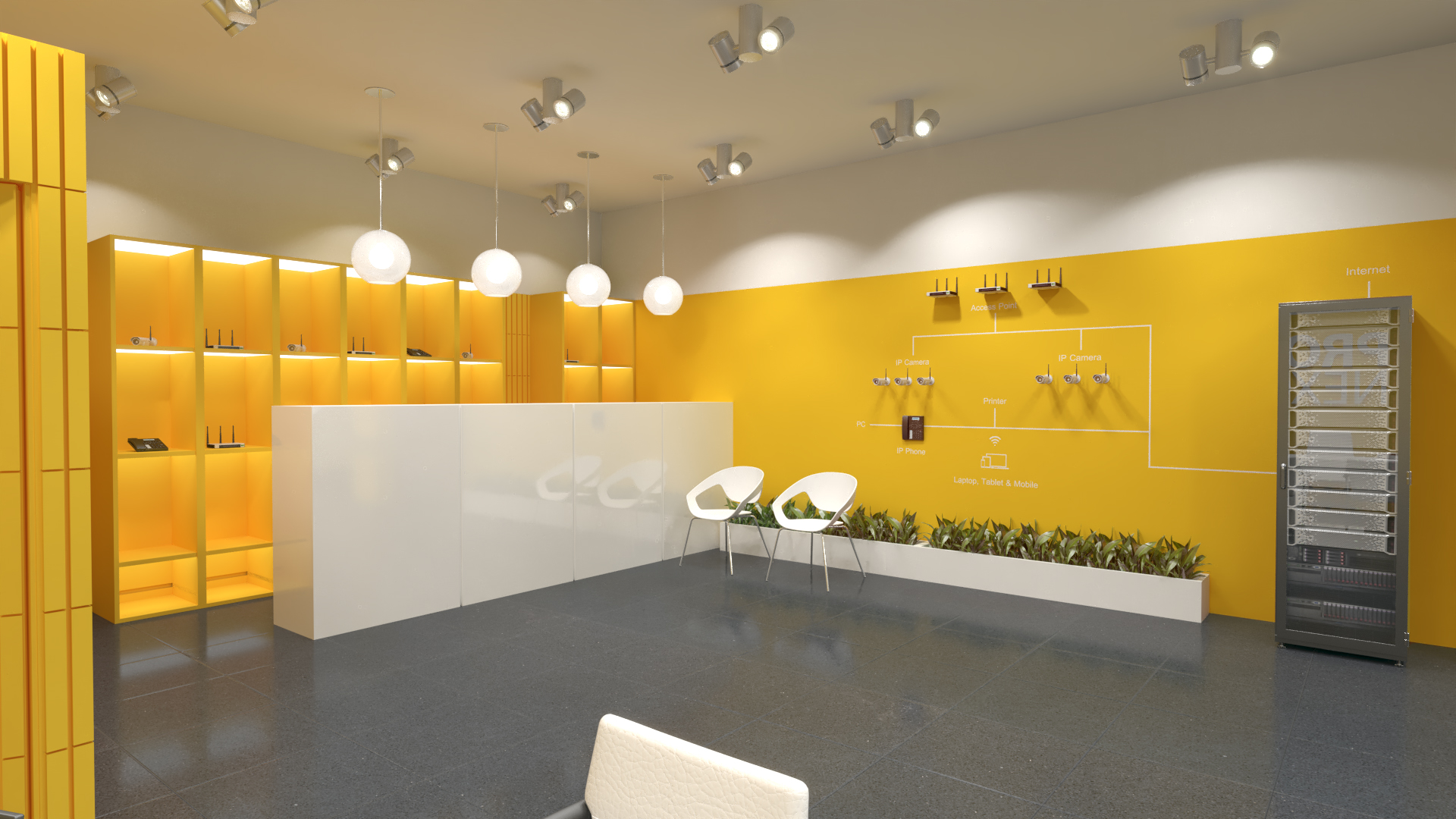
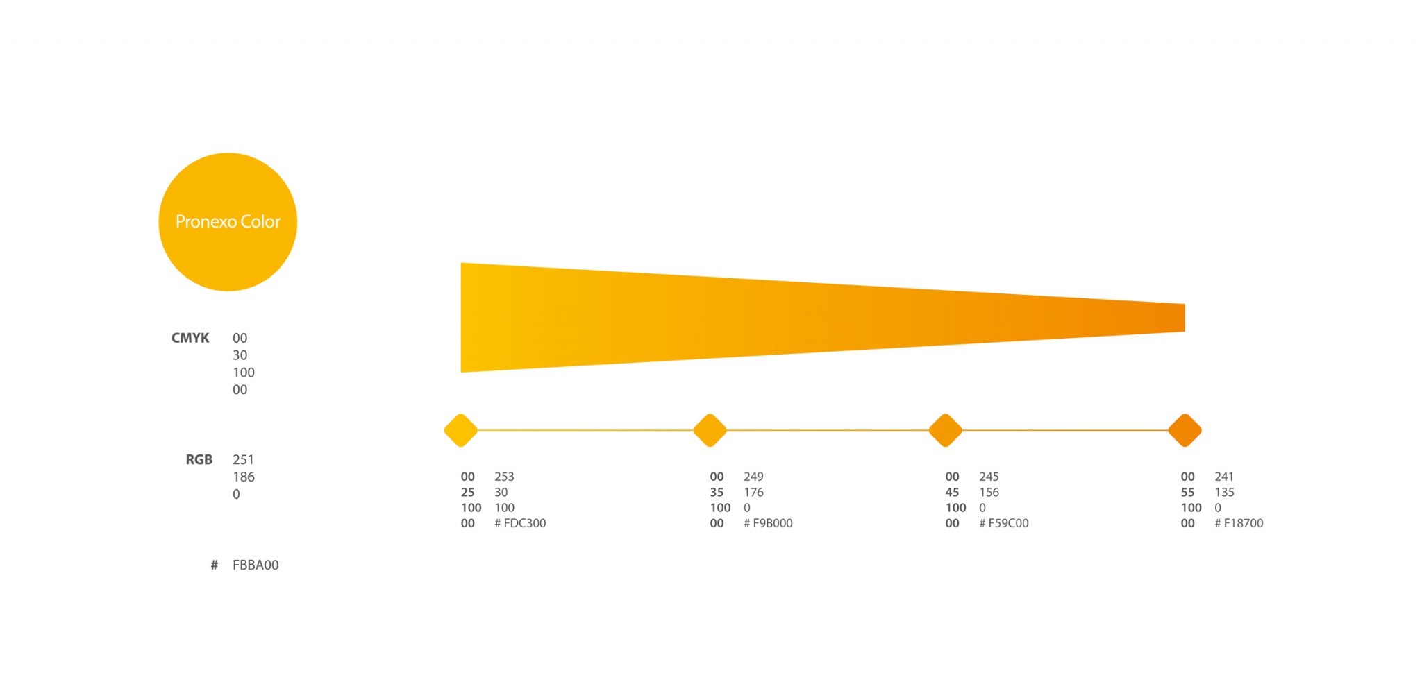
A path for Pronexo’s visual identity design had to be chosen that could create the most differentiation from other competitors in the network equipment market. The solution of Vand designers was to choose one color design strategy. In fact, this design strategy helped a lot in brand awareness and achieving the right position. Because before Pronesco, yellow was not used in the network equipment market, and because of this, it created a good distinction between this brand and other competitors.
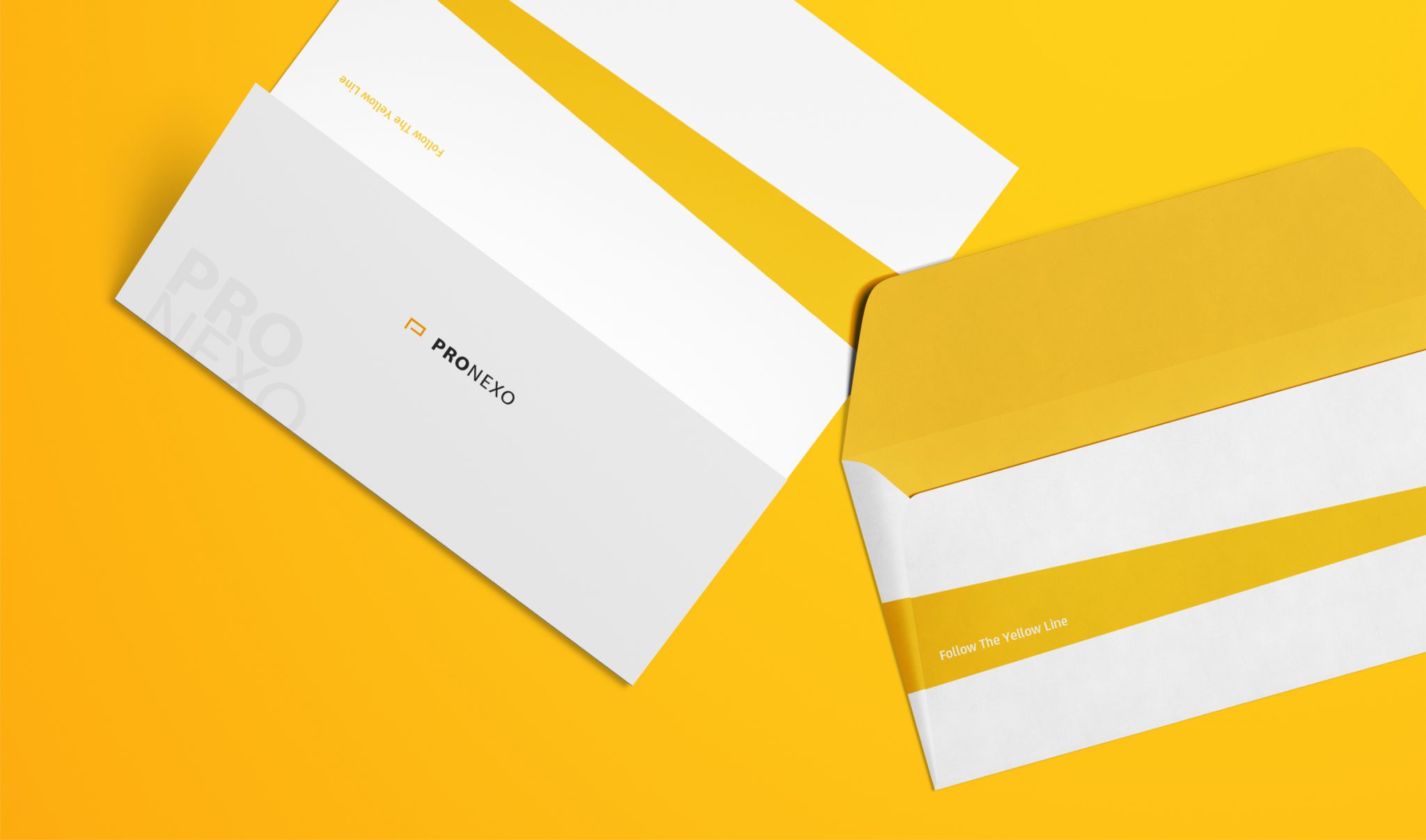
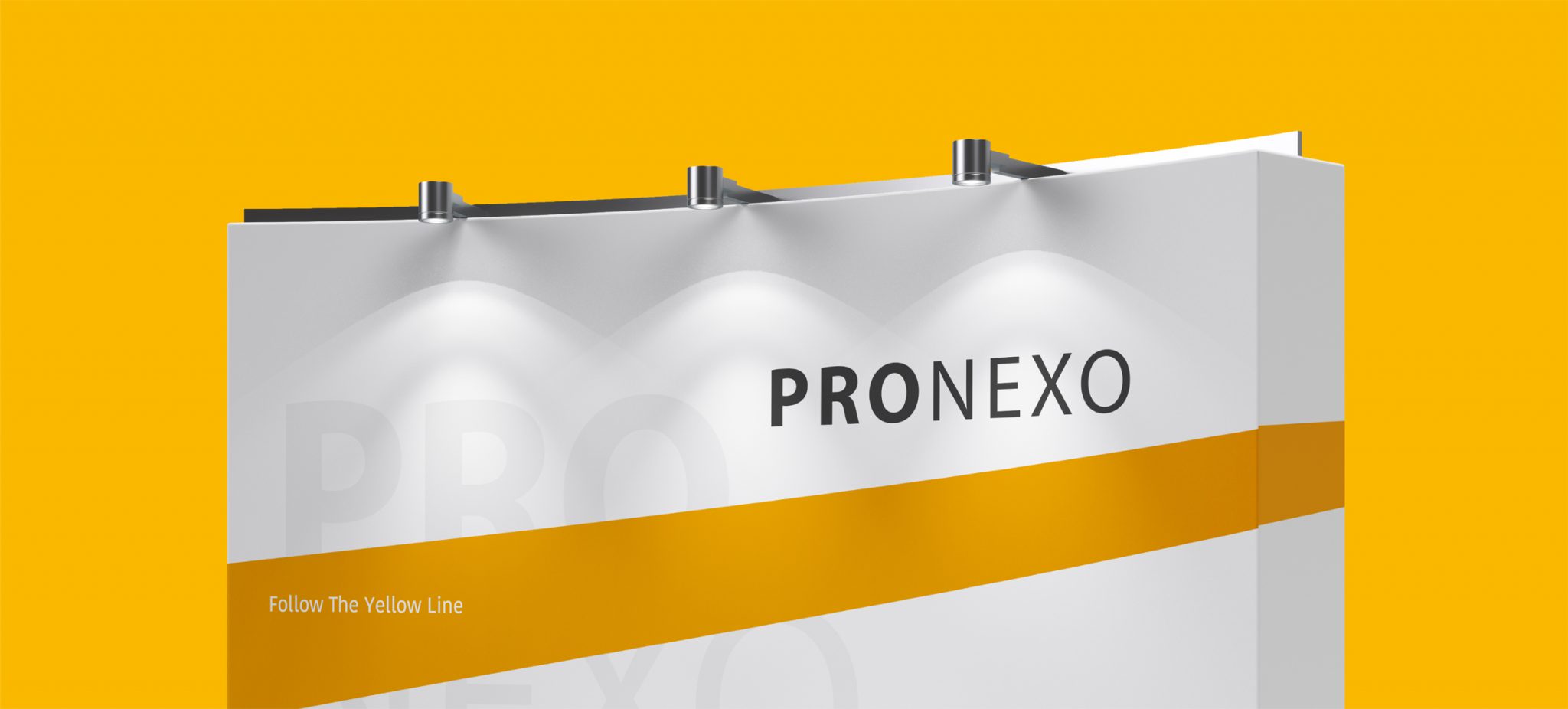
In 2018 (two years after the visual identity design project), the Passage Iran advertising campaign was held. The aim of the campaign was to increase Pronexo brand awareness among the main audience of the brand by being present in the most important business center of the country’s network and equipment market. Here too, Vand’s basis in the designs and in general the execution of the campaign was based on the use of yellow color. Because in addition to guaranteeing the ownership of the yellow color for Pronexo, it also created an effective way of communication with the audience. In this campaign, the brand slogan “Follow the yellow line” was used. The process of cooperation between Vend and Pronexo reached the design of internal and external visual identity of physical stores in 2019 and this process is still going on.