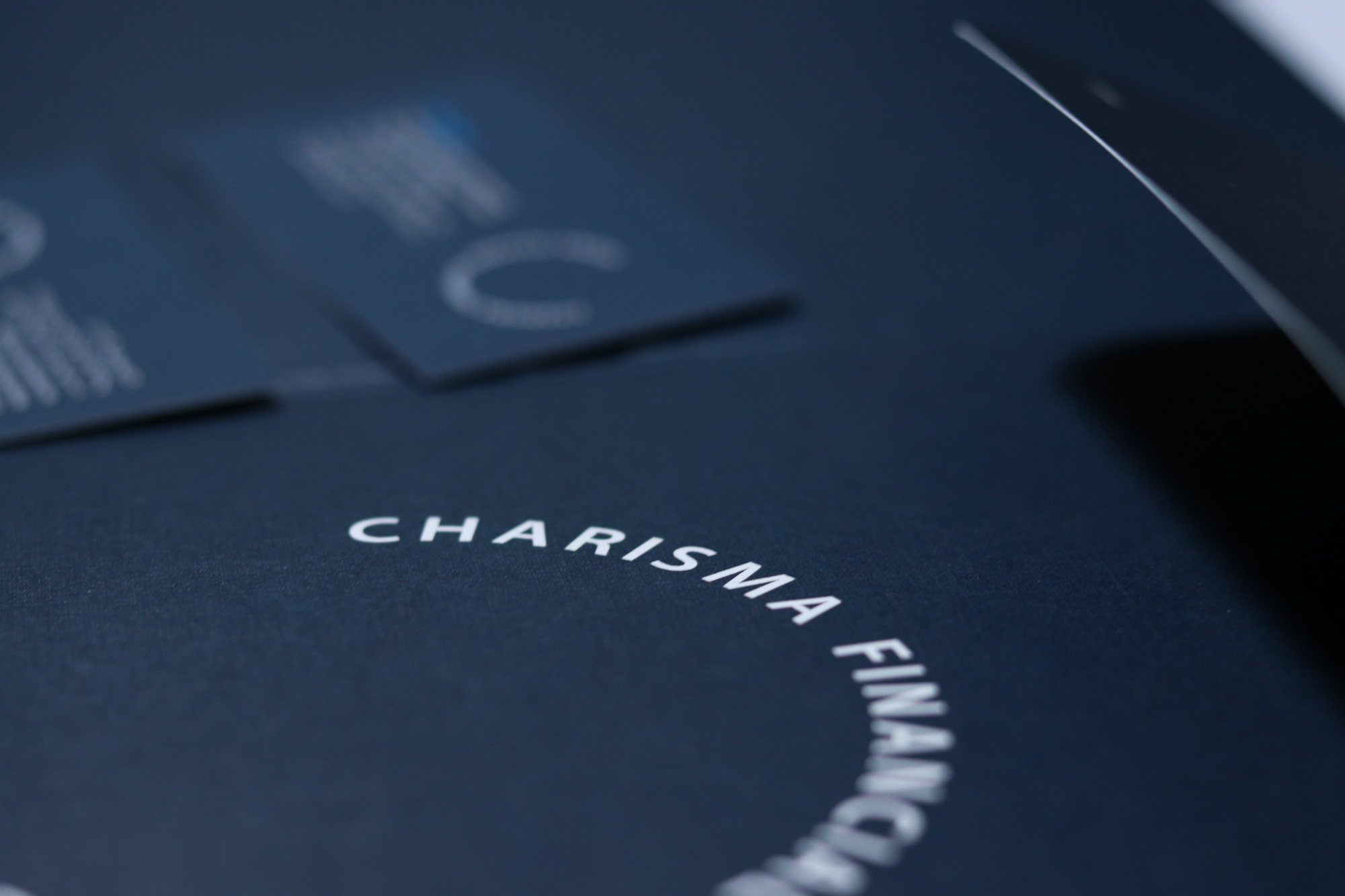
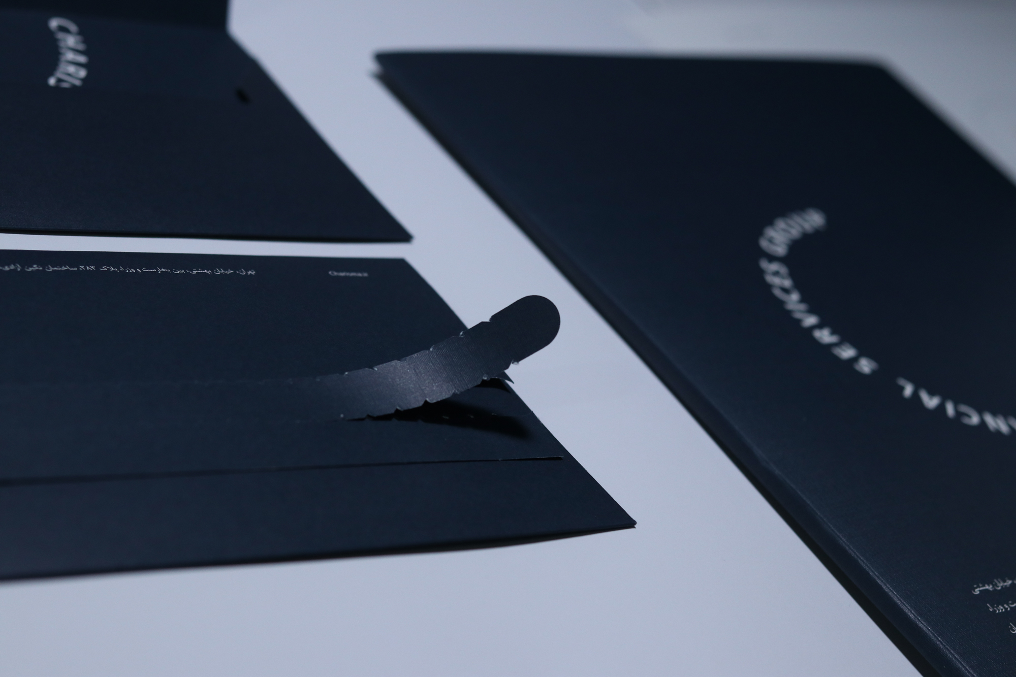
It was a small portfolio company that wanted to become a bigger financial leader. Vand International Company was invited to add new visual capacities to Charisma in line with the development goals of the brand while maintaining some elements of the previous visual identity. Originally, Charisma needed a distinct design identity so that later when it became a holding, it would have an independent identity from the players in this industry.
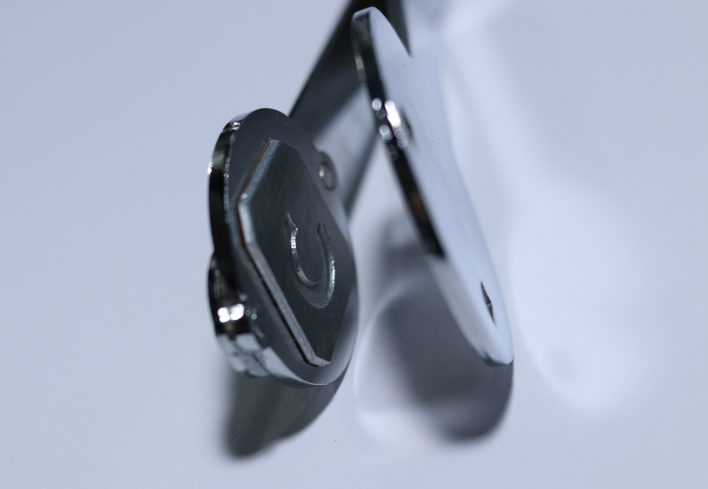
The logo was designed using the English letter C (derived from the beginning of the word Charisma) in a simple form but different from conventional written forms. But the most important design point of this project, which was bold, was the use of red color in the logo. Red color is considered a very dangerous color for listed companies, and because it means the fall of the share value, companies generally do not come to it. Knowing this, the designers of Vand International Company suggested that the only way to differentiate in this market is to use a color that no one dares to use.
A few years after the completion of the project, Charisma became a large holding company. The image identity created for Charisma, since it was created with detailed principles and strategies, was completely aligned and compatible with the brand development path. Also, the Charisma logo is still the only logo of Iran’s capital market that has a red color. Red color not only did not cause a negative impact on Charisma’s audience, but also gave this brand a distinctive and unique reputation.