
“In redesigning a useful visual identity, we pursued two goals. First, reflecting the unique and useful approach and position in accordance with the global realities of the capital market. and second, unifying the visual identity and developing it across all touch points. Our assessment indicated that Mofid Brokerage is the leader of the capital market in its field of work, so the basic strategy of visual identity design was developed in such a way that it can represent this leadership and power.”
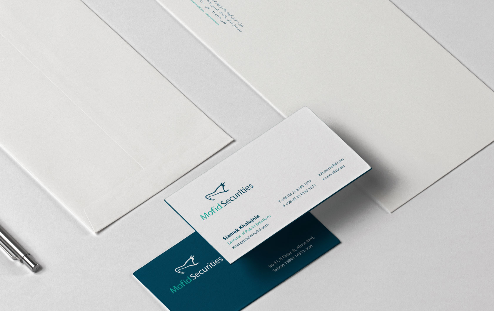
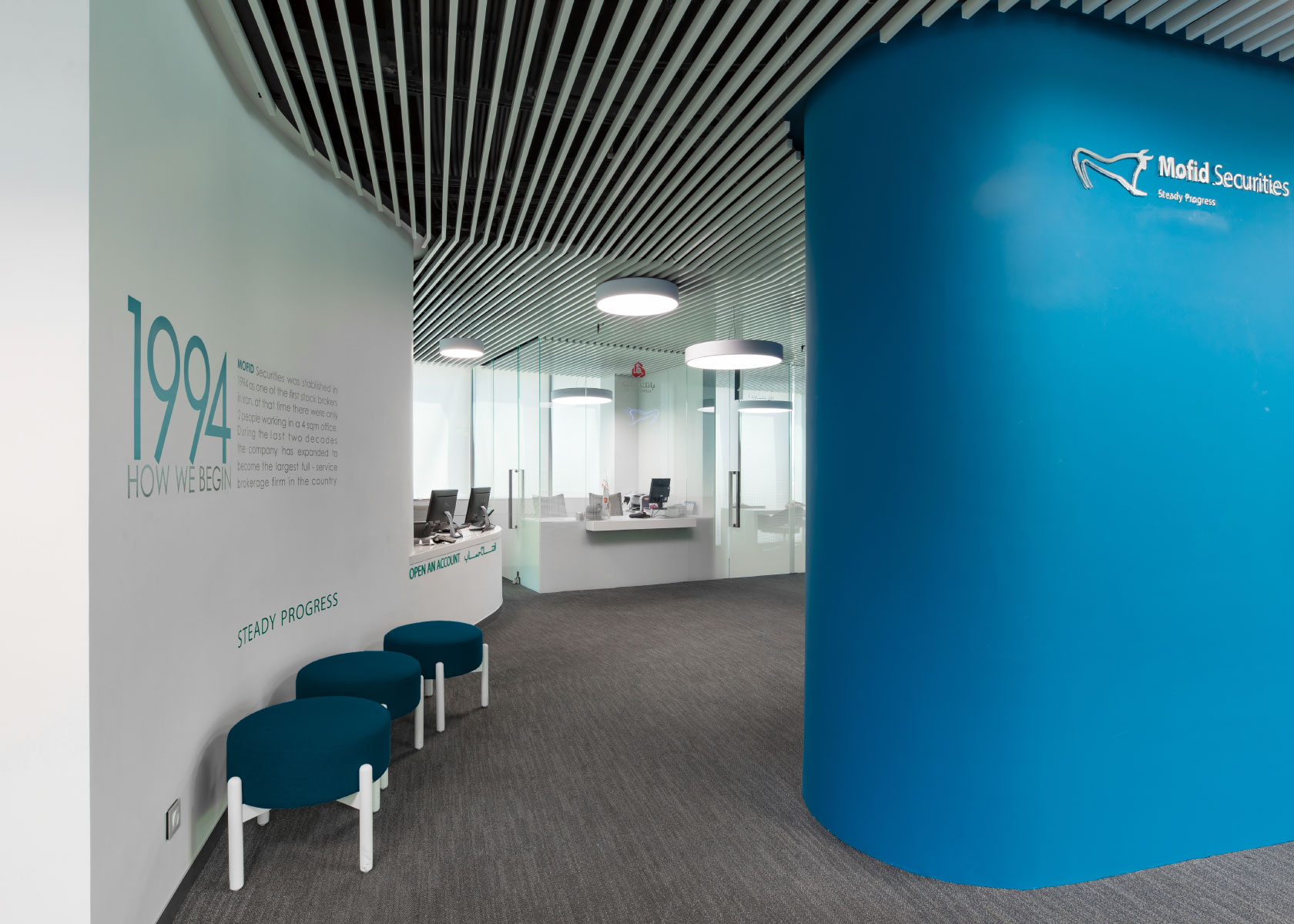
“Choosing fresh colors for a useful visual identity had two important strategic bases: “Green color” in the capital market is a sign of growth. “Also, next to the green color, the “red color” was chosen for Mofid, which indicated the competence and weight of the market leader and gave it more dignity.”
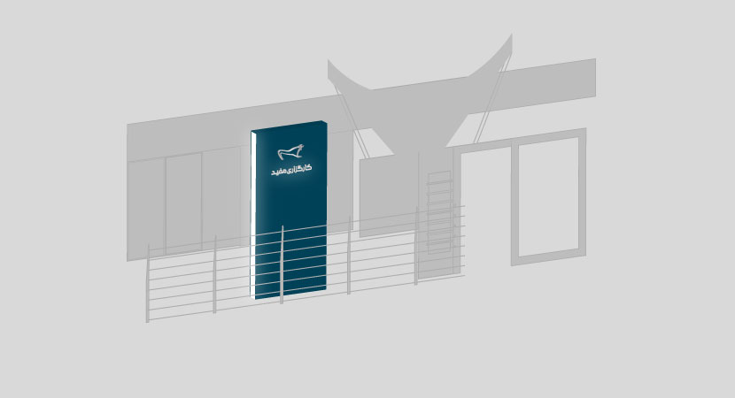
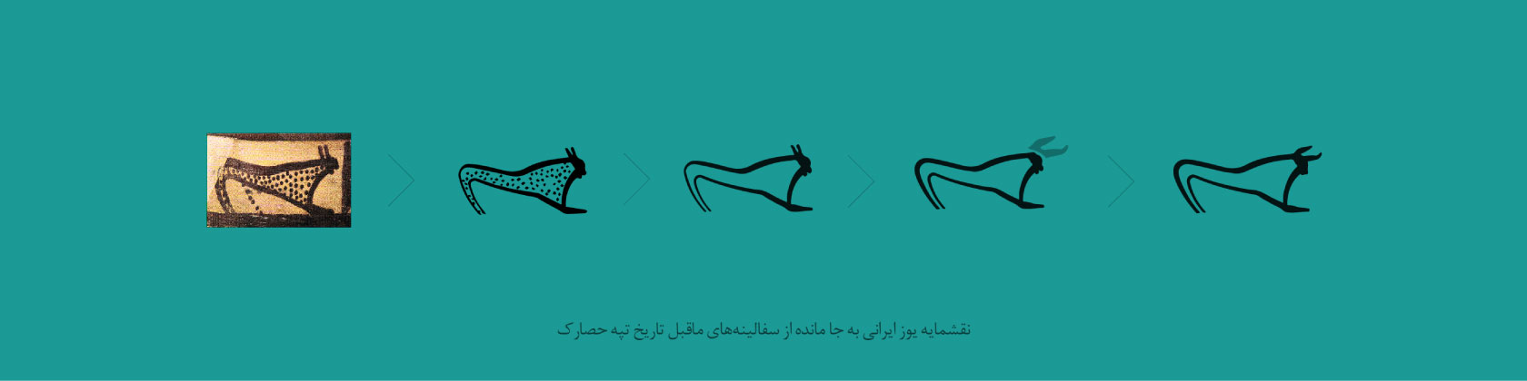
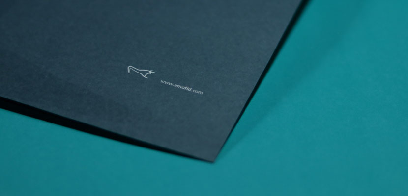
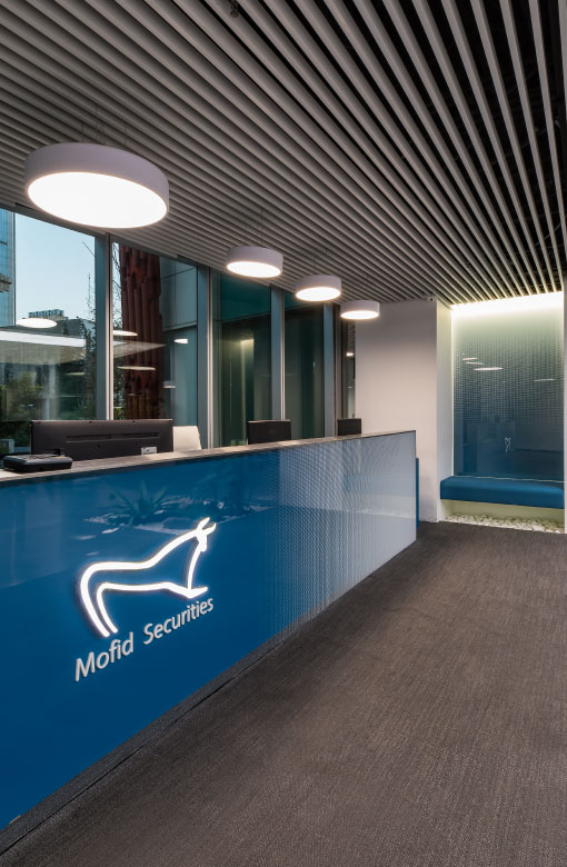
“The design of the logo was based on the concept of “stock market bull”, which had a suitable capacity to evoke elements such as strength, dignity and peace. The initial design was inspired by the image of ancient animals carved on pottery discovered in the ancient area of Tepe Hesar (6 thousand years old). We believed that there is a strong semantic connection between the useful nature and the design of the ancient animal. In the original sketch, the animal has its head down and although it appears still, it seems as if it is about to charge forward with full force to take over the battlefield. As in today’s Iranian capital market, Mofid’s name conveys such a powerful image.”
“It was very important for us that the original design was Iranian. We used the historical German related to the art of ancient Iranians in the design of the emblem, but not with its old and ancient character. The new coat of arms tries to keep simple lines and at the same time has a fresh interpretation of this ancient character that brings it closer to the shape of the cow as a universal symbol. In Iran’s art treasure, there was a flawless design of an ancient animal that had been dusted and forgotten; We pulled it out from the depths of history and used it in the visual identity of one of the most modern Iranian companies. “Instead of creating a plan with the bad taste of the 21st century, we referred to history and chose the best taste.”
