
Lafarrerr is one of the big brands in Iran’s cosmetics industry, which faced two main challenges in the field of brand image identity. First, this brand was operating in a very busy market and its managers were looking for a different design identity in order not to get lost in the crowd. Another challenge was the large number of products that were produced at Lafarrerr. They had dozens of different products that they had to find a design solution to separate and differentiate between them.
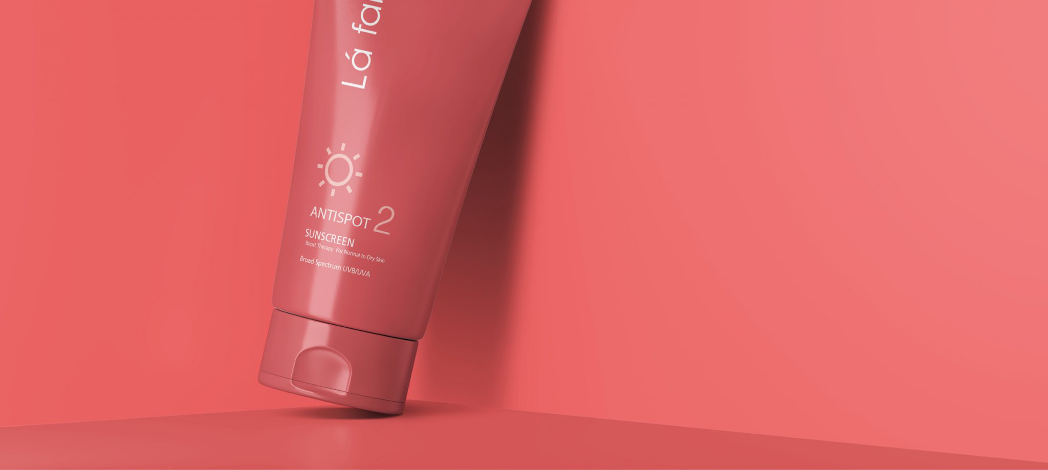
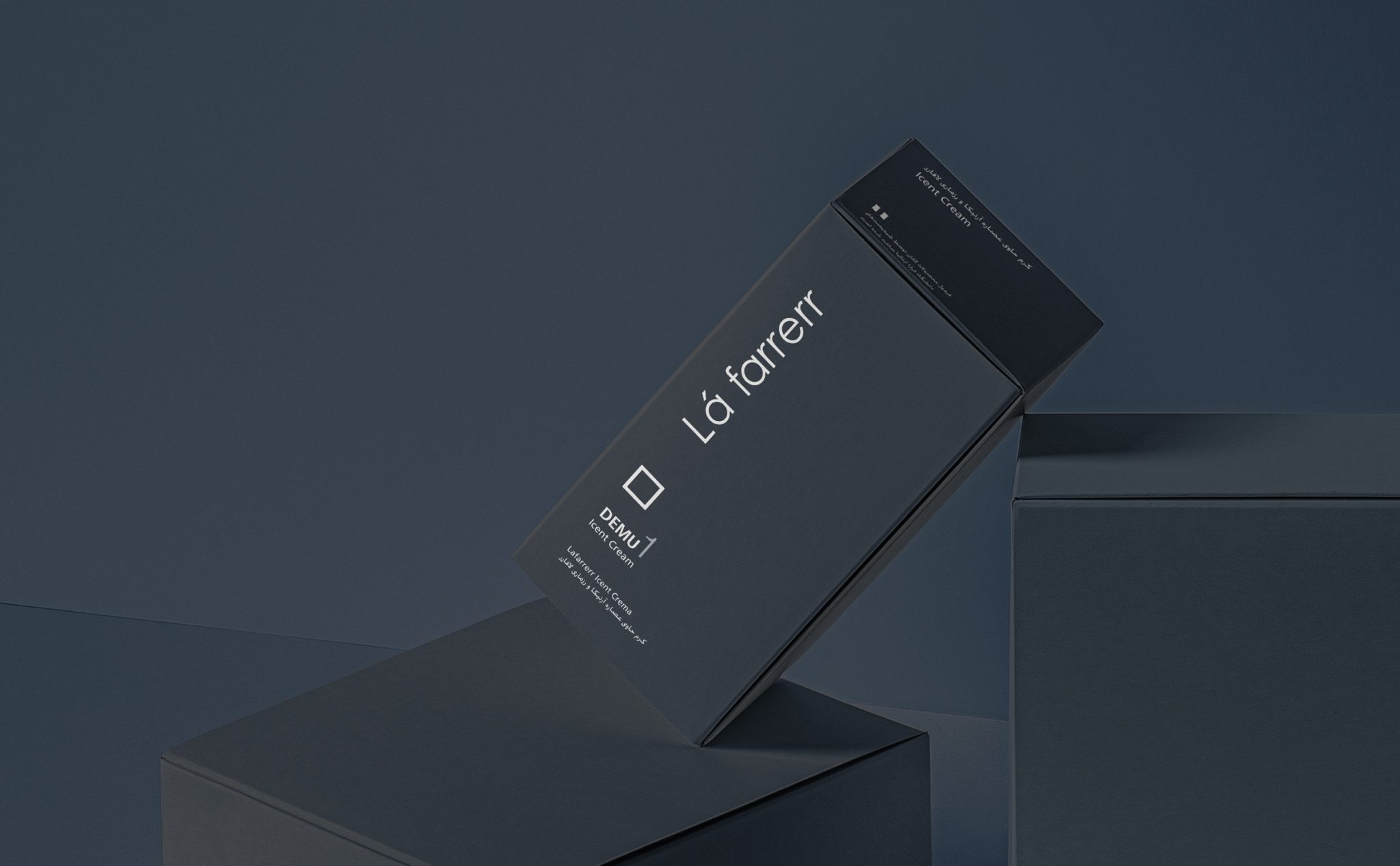
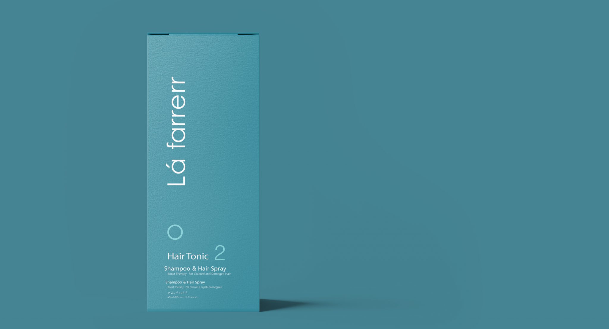
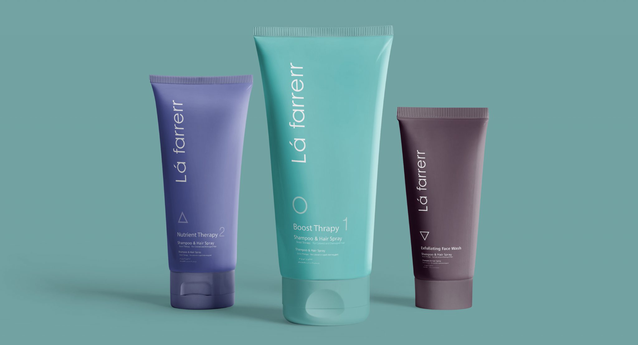
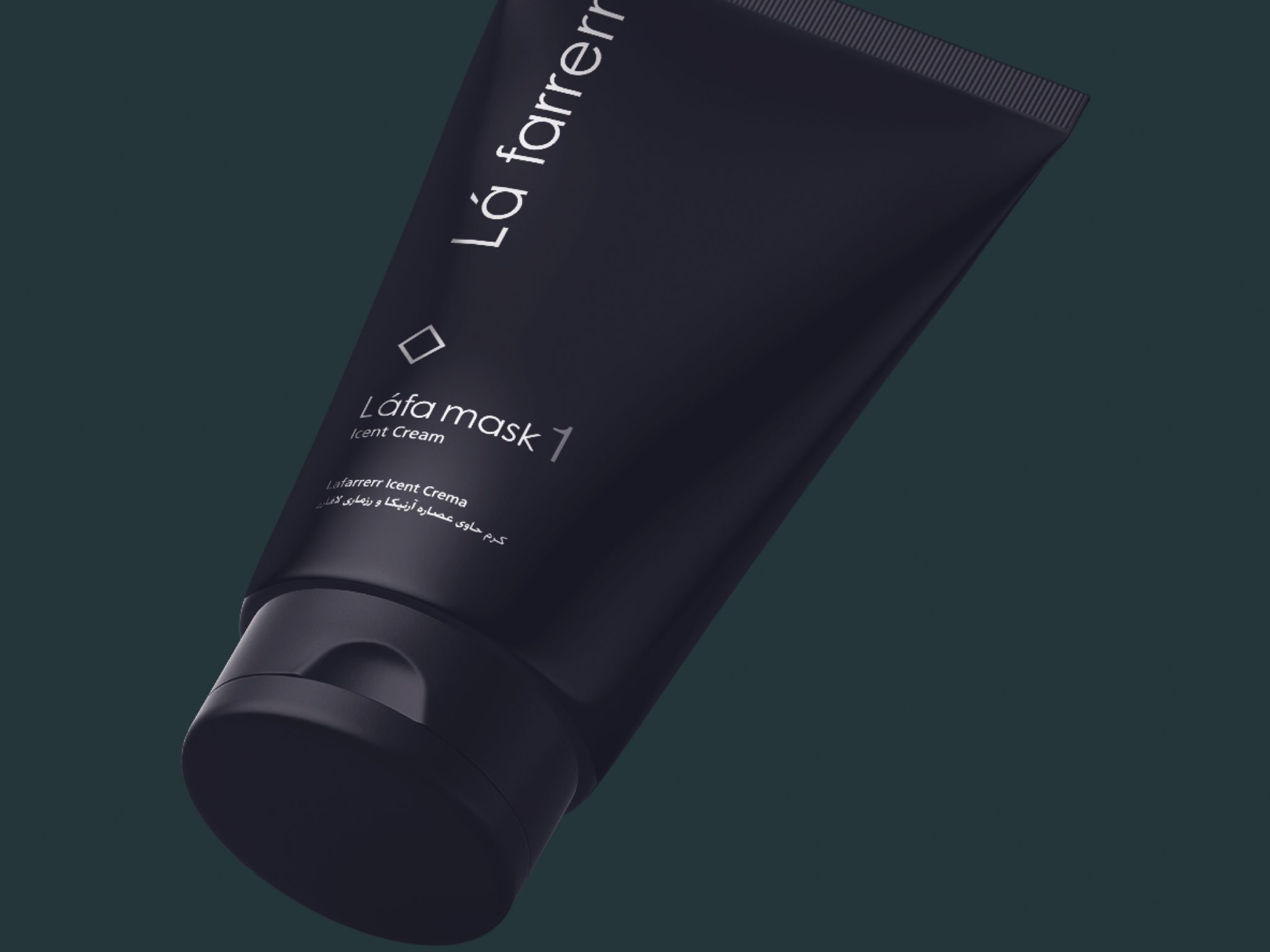
The solution that Vand’s design strategists proposed to differentiate Lafarre’s designs from the competition was that in the very crowded market of cosmetic-hygiene products where everyone is talking loudly, Lafarrerr should be the brand that speaks softly and is even somewhat silent. Very simple designs were made for Lafarrerr so that Lafarrerr can be seen distinctly and simply in any crowd and chaos and trying to attract attention from competing brands. It was decided that this simplicity would become Lafarrerr’s signature.
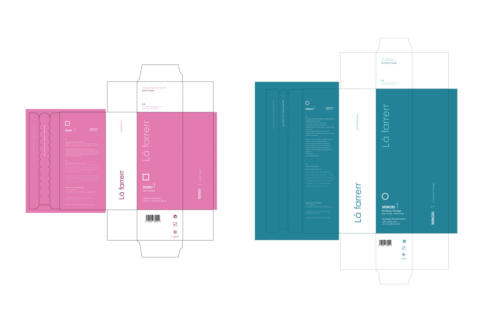
To differentiate Lafarrerr products, very simple white shapes were used on the product packaging. Also, a unique and different color was chosen for each product. Colors that were all defined in the middle spectrum of the color circle and had a clear distinction with very sharp and very dark colors. The goal was for the product buyer to easily remember and recall both the color and the special marking of each product. Especially this issue helped to prevent the mistakes of pharmacies in offering Lafarrerr medicinal products instead of each other
This brand became very impressive after entering the market and experienced rapid growth. According to Lafarrerr managers, the different designs that were made from the careful strategy of this project have played an important role in the fate of this brand in the market full of cosmetic-health products.
