Description of the problem
Lafarrerr is one of the big brands in Iran’s cosmetics industry, which produces specialized products with the benefit of the latest technology. In the field of visual brand identity, Lafarrerr approached Wend International Company with two main challenges. First, this brand was operating in a very busy market and the number of actors and companies active in the cosmetic-hygienic market and the number of products they produce was very high. The concern of brand managers was that the busy nature of this industry would make a new brand unable to attract any attention and practically be hidden from the audience. They had come to the conclusion that in order for the new brand not to be lost in the crowd, they should have a very different design identity.
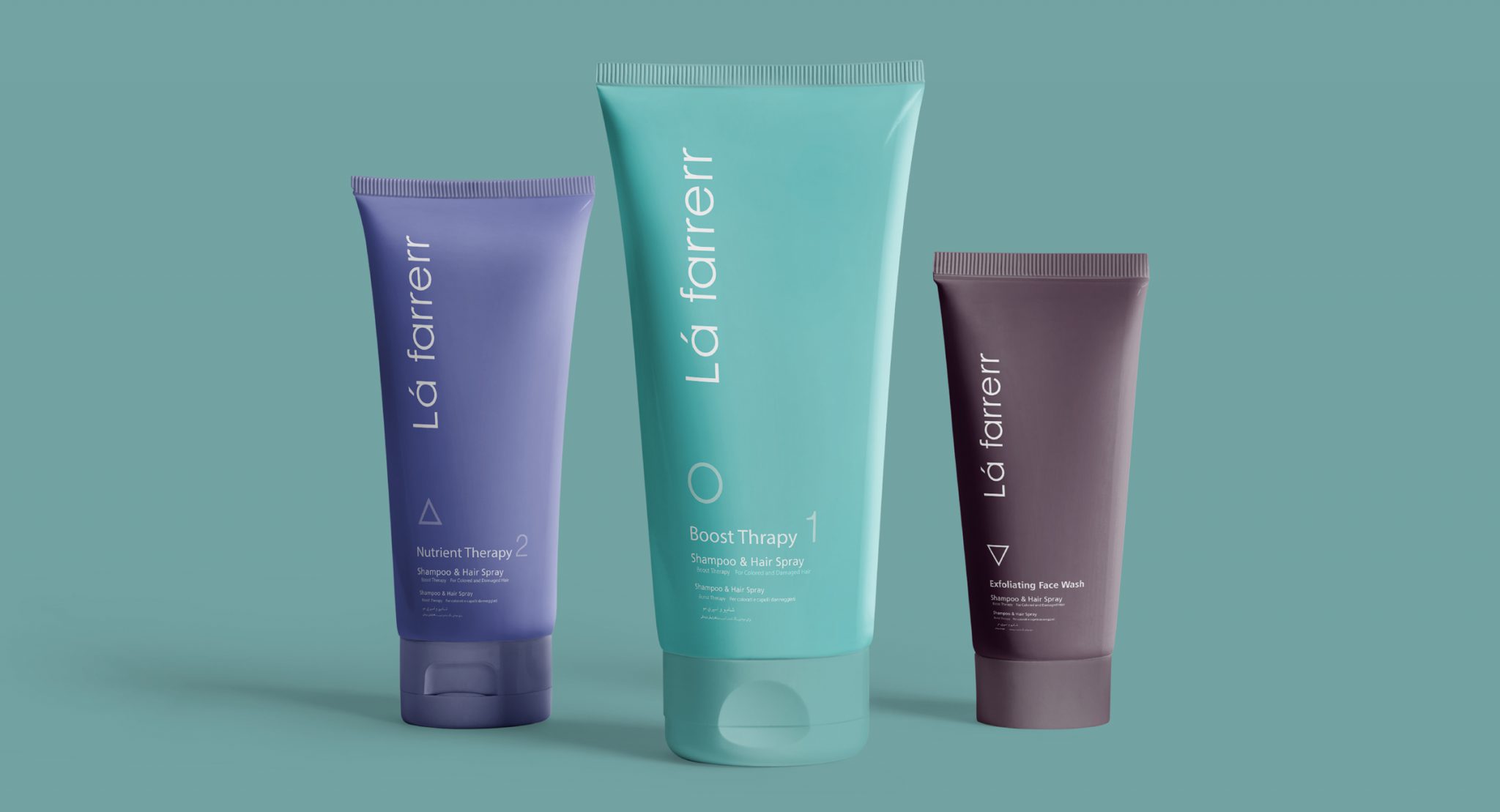
Another challenge that the Lafarrerr brand managers raised in the initial meetings with the Vend team was the large number of products that were produced at the Lafarrerr company. They had dozens of different products that had to be thought of to separate and differentiate between them. There was a great variety of products and there were so many similar products that it happened many times that pharmacies mistakenly sold a cream meant for wound inflammation to patients instead of an anti-shedding ointment, and Lafarrerr managers wanted the design of their products to be distinctive in order to prevent such errors. be taken as much as possible.
Challenges and solutions
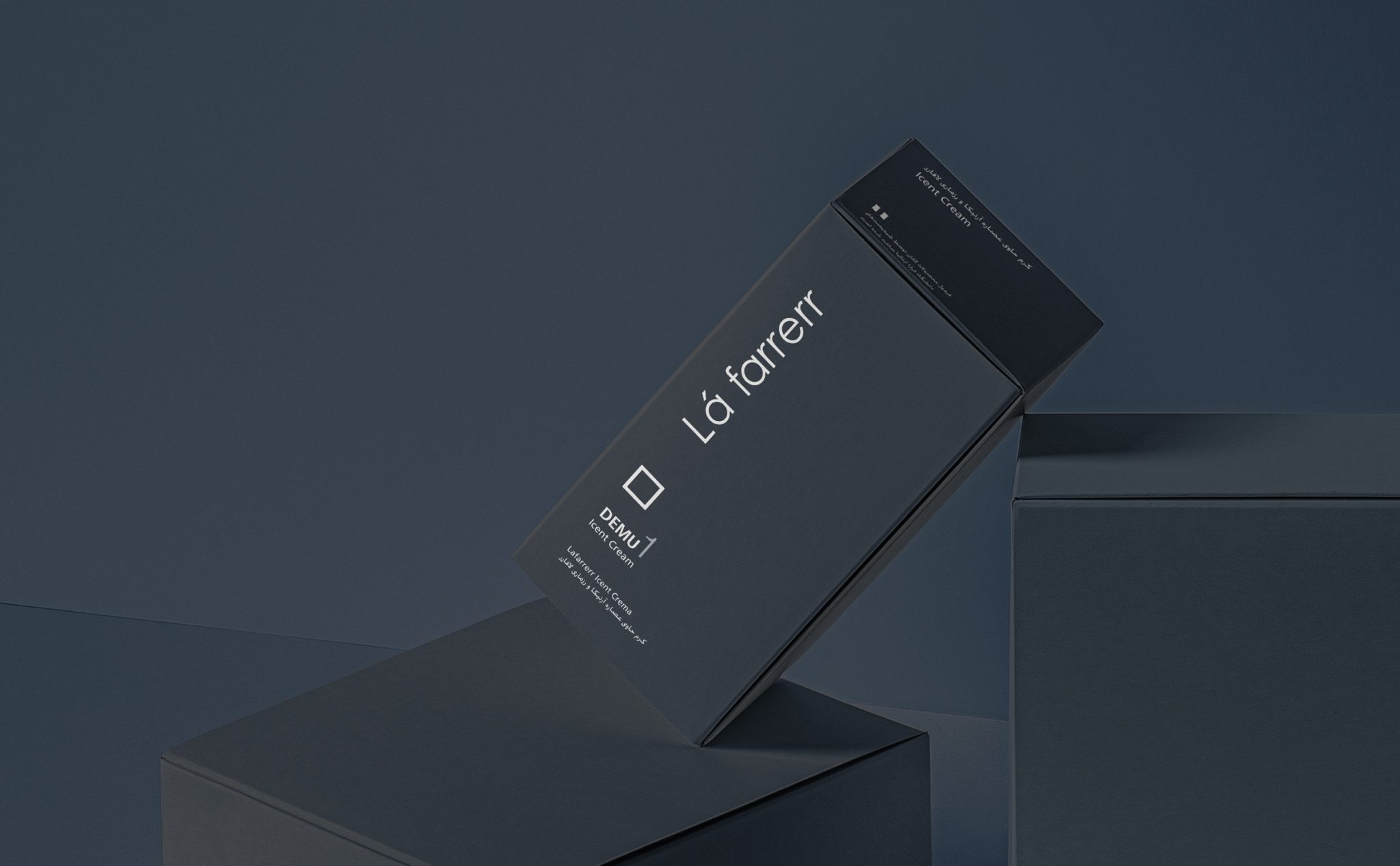
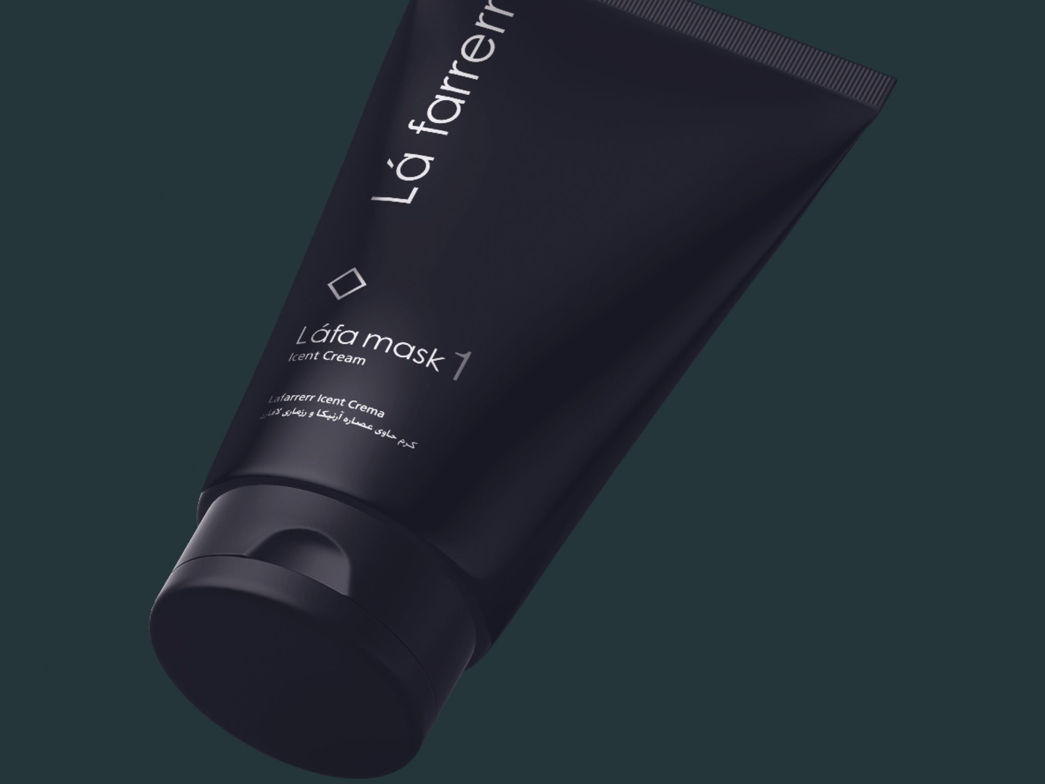
The solution that Wend’s design strategists proposed to differentiate Lafarrerr’s designs from the competition was that in the very crowded market of cosmetic-hygiene products where everyone is talking loudly, Lafarrerr should be the brand that speaks quietly and is even somewhat silent. Therefore, very simple designs were made for Lafarer so that Lafarer can be seen distinctly and simply in every crowd and chaos and trying to attract attention from competing brands. It was decided that this simplicity would become Lafarrerr’s signature, so that the design of dozens of Lafarrerr products would become uniform with this simplicity.
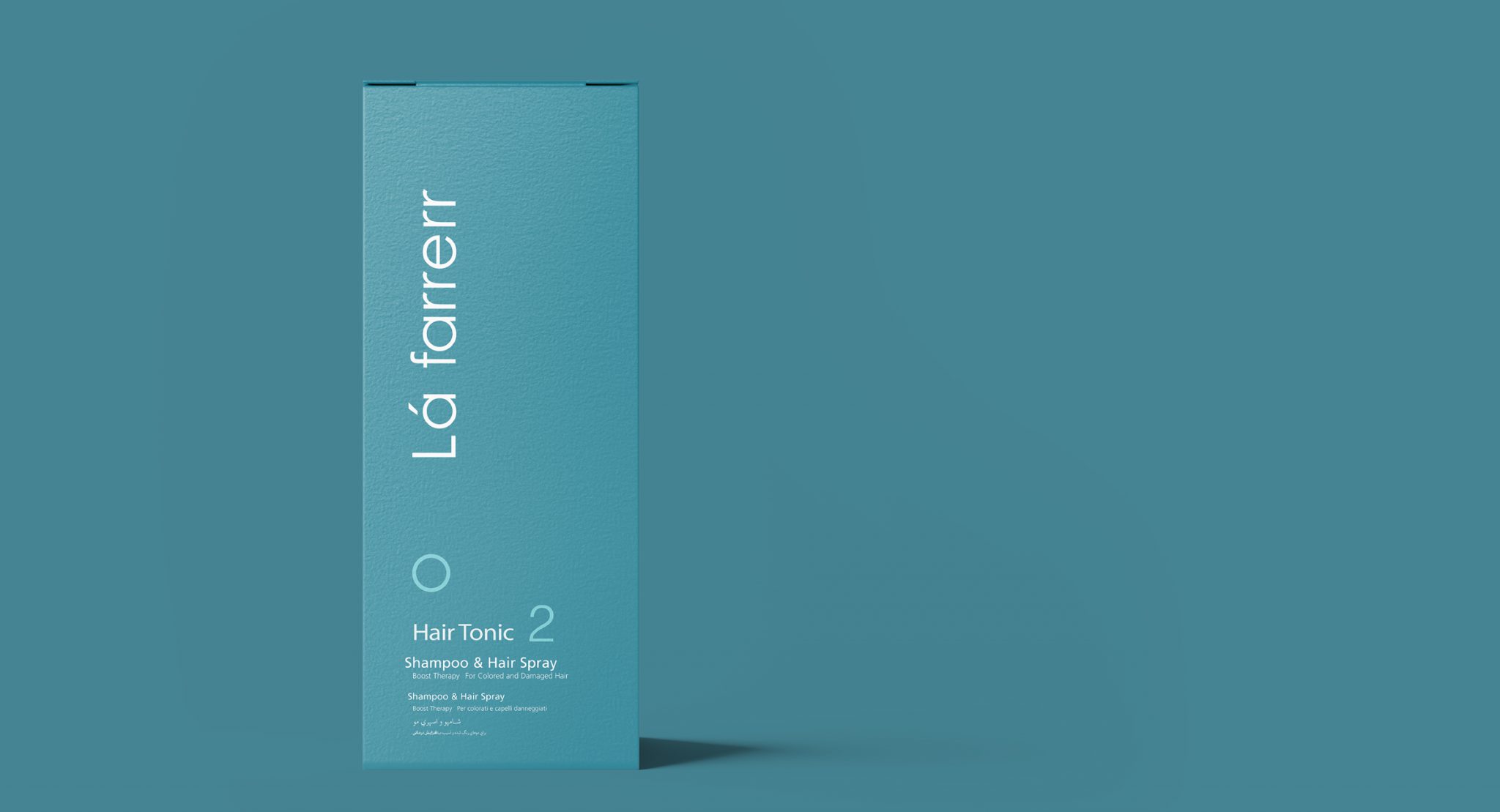
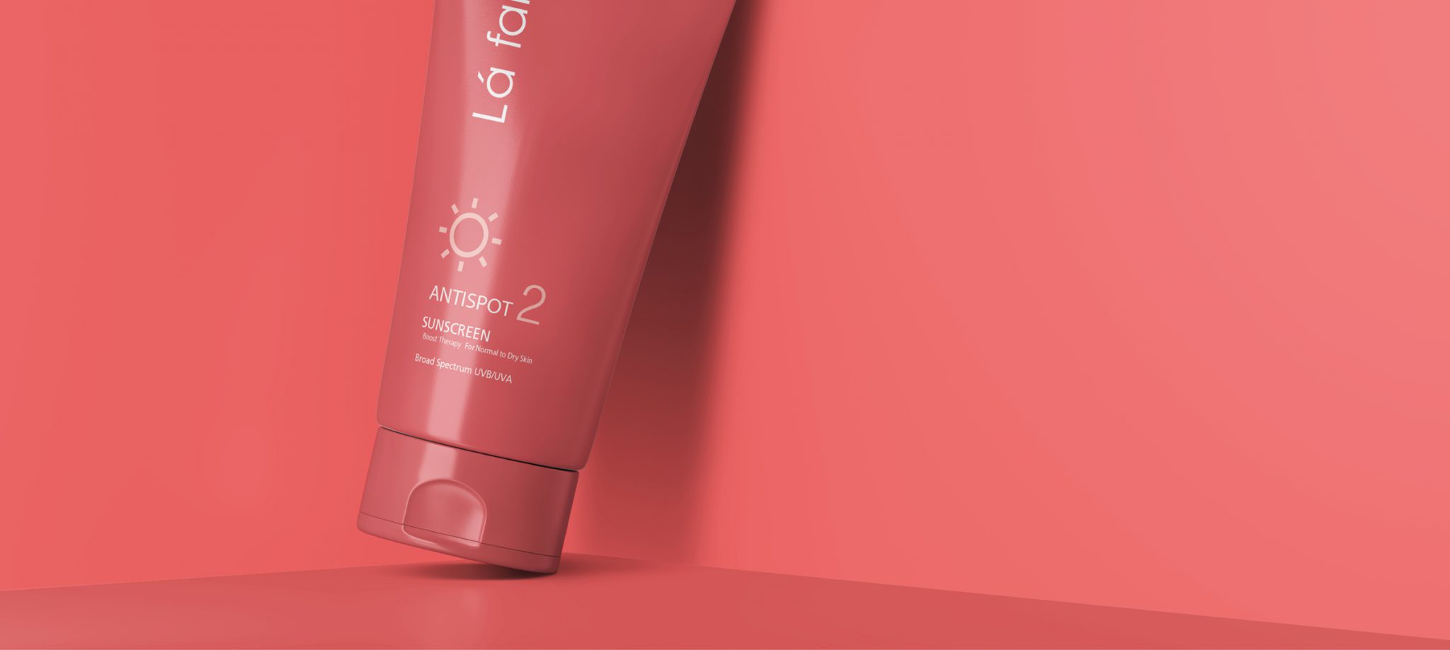
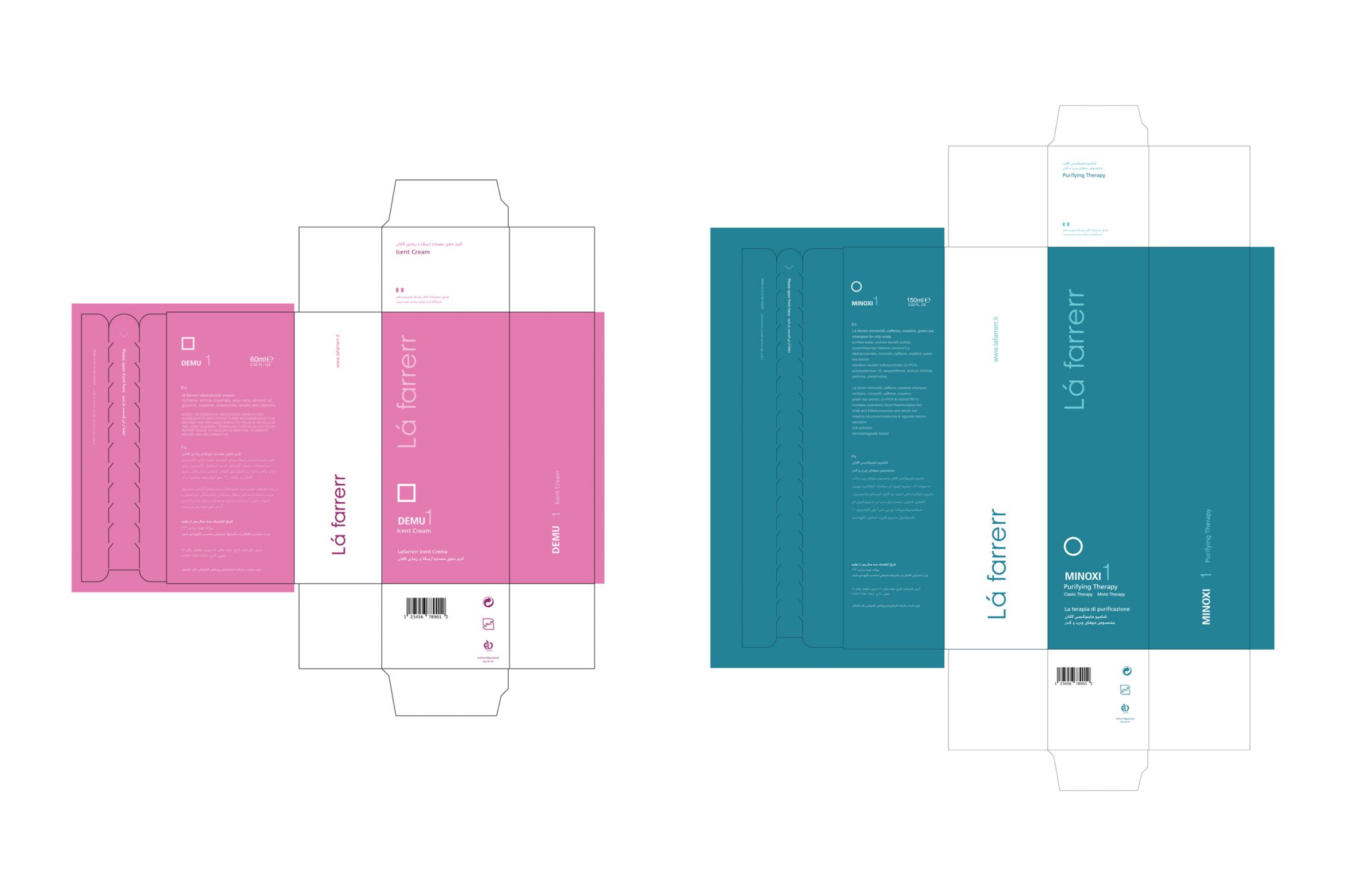
There were two form tools to create internal differences between Lafarrerr products. One is packaging and the other is color. In the packaging, the simplicity of the form that was the common point of all designs was used. A unique and different color was suggested for each package. Colors that were defined almost in the middle spectrum of the color circle and had a clear distinction with very sharp and very dark colors.
To differentiate the packaging of Lafarrerr products, a series of white symbols were also used on the packaging. Very simple shapes were used so that people can easily remember it. The goal was for the buyer of the product to easily remember and remember both the color and the special marking of each product. Especially this matter helped to prevent the error of pharmacies in offering Lafarrerr medicinal products instead of each other.
Results and effects
This brand became very impressive after entering the market and experienced rapid growth. According to the senior managers of this brand, the different designs that were made from the careful strategy of this project have played an important role in the fate of this brand in the market full of cosmetic-health products.
The “Don’t be a continuation of stereotypes” campaign in February 2018 was another project that Vand International Company did with the Lafarrerr brand. This social responsibility campaign was an effort to show the threats that prevent the presence and social and economic participation of women in the society. In this campaign, which was held in partnership with “Pregas Teb” company, the health care and beauty manufacturer of the Lafarrerr brand, the aim was to inform the general public about common gender stereotypes. The stereotypes that exist in the view and approach of different people and groups towards women and prevent the flourishing of women’s abilities and talents. This campaign was held in three phases: identifying and producing media content about stereotypes, raising awareness and strategies to deal with stereotypes, and introducing successful and inspiring women in overcoming stereotypes.
Lafarrerr colleagues:
Mr. Kamkar – CEO
Shayan Rezagholi – Designer
Team members:
Toraj Saberivand – Design Strategist
Jalil Noorbakhsh – Strategist
Ali Jamali – Designer
Mitra Ferdowsi – Content Strategist and Media Consultant
Time of the project: 1394