Description of the problem
Alibaba was a travel and tourism agency in Qaytarieh, Tehran, which operated traditionally.
In July 2014, after the unveiling of the Alibaba website as an online air ticket sales system, this company sought to gain a larger share of the country’s tourism market. Changing the position required fundamental changes in the designs and visual elements of Alibaba.
Design Vand consulting company was invited to create a comprehensive and integrated image identity for this brand. Wend team’s cooperation with Alibaba managers continued during the following years and in line with the company’s growth, in the branding projects of Tosha Investment Holding (Alibaba’s investor) and the visual identity design of sub-brands such as Zoroq and Jabama. The visual identity of all sub-brands needed to converge around a completely new development objective that took into account the needs, behaviors and expectations of today’s customers.
Challenges and solutions
According to the attitude of the strategy team of DesignWand, first you should pay attention to the brand name and then go to the logo design. Therefore, the main solution in this project was very clear: the logo design should resemble Alibaba’s face so that the audience recognizes it.
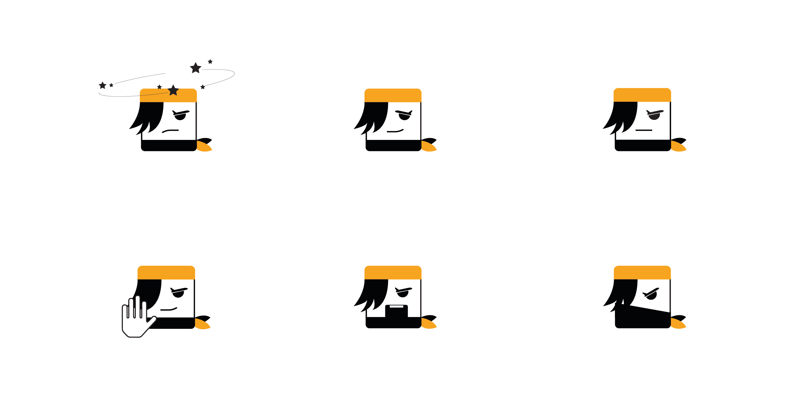
Alibaba logo design went through a complicated process. Alibaba is a famous character in literary stories and anecdotes, so there are various associations and faces of him. Ali Baba is the adventurous Sinbad who is famous for his travels and adventures among Iranians, but many others remember him with the story of the forty thieves of Baghdad. This personality has also stepped into the world of business and the Chinese Alibaba online store owned by “Jack Ma” is very famous in the world. Our strategic action in designing the logo, while referring to the familiar elements of this character, was to create a special shape and image for Alibaba in accordance with its Iranian narrative. We designed a face that is adventurous, energetic and exciting to create a clear distinction with the Chinese Alibaba and other associations.
The details of the face were conceptualized using elements related to the tourism industry. The eyebrow of this dummy is designed in the shape of an airplane, which shows the nature of Ali Baba’s business.
Our important creativity in this project was dynamic logo design. We predicted different modes for Alibaba’s face; including sad, angry, happy and smiling states. In our opinion, the inclusion of emotional flexibility in the logo allowed the brand to respond appropriately to the various issues of the day. This initiative has a positive effect on the branding of the brand name in the mind and conscience of the audience.
The clothes of Alibaba’s character in the narratives do not have a specific shape and color. Various color palettes were deeply examined and finally we chose yellow color for the Alibaba logo for several reasons: firstly because it matched the energetic and exciting personality of Alibaba and secondly because the color yellow is less used in the tourism industry and therefore it could Make a distinction.
“Tosha” investment holding branding
Some time after the completion of Alibaba’s visual identity redesign project, Tosha’s branding project was launched. “Development of a worthy travel experience” or “Tosha” was a newly established venture investment holding that invested in tourism startups such as Alibaba, Jabama, Zoroq, Heloporsia, etc. Due to the nature of this business, our strategy was to build a risky brand identity for Tosha. With the aim that people see the logo and other elements of image identity and find out the existence of high capital and high risk of this brand; That too at first glance.
According to the bold nature of the company’s field of activity, the logo was also designed in a bold way. Tosha’s logo is somewhat different from other Alibaba logos. Tosha had a corporate nature and not a startup, and in this sense it seemed more serious. We suggested to Alibaba managers to consider investment with a different concept. That is, instead of using logos such as seeds, saplings, and coins, they should think about the concept of a unicorn and becoming a billion dollar. Our specific suggestion was to design Tosha in the form of 9 zero billion digits. That is, instead of the two letters O, from 9 to zero, and the letter T should be used instead of the number 1. The color of the logo is also close to the green color of dollar bills.
Visual identity of “Jabama” startup
Two years after the Alibaba project, the same team founded the Jabama startup in the field of accommodation, hotels, and ecotourism. The strategy of creating a unified identity for family logos led us to choose yellow for the Jabama logo, which was harmoniously related to the Alibaba logo. We also emphasized on the closeness of the form and nature of Alibaba and Jobama logos. Our reasoning was that if Jabama is not a face and a name that has an external image and meaning, it should at least be designed like a face to create minimal similarities between the Jabama logo and the Alibaba logo.
Redesign of the boat logo
When the Zarooq reservation website also joined Tosha Holding and Alibaba’s sub-brands, we were asked to rebuild the visual identity of this company. Our research showed that the main problem with the boat logo is the coloring and writing. DesignWand’s strategy was not to make the boat similar to Alibaba or close to it. For this reason, by avoiding yellow color, purple color palette was used. The defining element of the direction of Zorogh’s writing design was the personality of its audience. First, we determined who Zoroq’s audience is and in which category they fall into normal, premium, and luxury audiences, and then we included detailed details in the design of this brand’s writing. As a result, the final writing was more readable, more modern and different design.
Results
The result of sustainable cooperation and Vand with Alibaba was the creation of a unified visual identity in a family of prestigious Iranian tourism brands. Under this cooperation, a distinct and at the same time common image identity was created for Tosha, Alibaba, and its sub-brands, Zoroq and Jabama. Such action, in addition to improving the position of these brands in the tourism industry, created a large field of action for their marketing and sales.
According to the strategic design logic, we proposed different designs for brands in Alibaba projects according to the audience and the nature of the activities; But the link of the visual identity of the brands of the Alibaba collection is the representation of an exciting and energetic personality through the cartoon space of the logos. This identity provides the basis for a cohesive brand architecture that connects different initiatives, programs and ideas and supports the organization’s growth vision across business areas.
“Vand’s team creates designs with an eye on the organization’s identity and in accordance with its DNA. Alibaba’s logo was very bold in its time, and this boldness has shown its excellence over time. “Always my first choice for branding is Vand.”
Majid Hosseini-nejad- co-founder and CEO of Alibaba
“The newly designed logo had great potential due to careful attention to identity elements, the use of a simple but deconstructive form, and high differentiation from other symbols and signs of this industry. Since the beginning of 2015, in addition to the new logo itself, neckerchief and other special elements along with the color yellow as symbols and visual signs of the brand were noticed and widely used by the marketing team. The monochromaticity and identity of Alibaba’s flagship brand led to a 35% reduction in marketing costs in this collection and savings. It has been in expenses. Alibaba Group with its new visual identity has gained the same amount of attention with 35% fewer billboards. The reason for this is Ali Baba’s identity, design, and visual features, which are the product of the efforts of Vand company.
Tawheed Ali Ashrafi, Senior Marketing Manager of Alibaba
Alibaba colleagues:
Majid Hosseini-nejad-CEO
Nima Ghazi-Technical Director
Tawheed Ali Ashrafi – Marketing Manager
Team members:
Toraj Saberivand (Design Strategist)
Ali Jamali (graphic designer)
Nilofar Sharifi (graphic designer)
Project process: design strategy / brand image identity design
Project execution time: 1393