Asiatech

A readable identity

asiatech-branding-1

Description of the problem

Asiatech is the first company to remove the speed limit in intranet communication. As the most complete provider of communication solutions in Iran, Asiatech offers a comprehensive range of communication solutions to home and corporate subscribers. This large company has more than 700 active employees and has the most extensive fixed communication infrastructure in the private sector of Iran.

Asiatech’s management team had started a brand redesign program to improve some logo problems. The rebranding was supposed to solve the problem of the illegibility of Asiatec’s Persian logo in the first stage. In addition to being unreadable, this logotype lacked aesthetic aspects. As part of the project, Vand International Company was asked to create a new logotype for Asiatech.

Challenges and solutions

The logotype that the Wend team had to create was supposed to guide the audience to read the second part of Asiatech’s writing with fractions, taking into account the fundamental necessity of readability. Because this brand was not known at that time and the audience did not know the phonetic form of the brand and many called it Asiatek instead of Asiatech.

The first solution and the easiest way to avoid this mistake was to write the fraction under the letter “t”. However, there was a bigger problem, that is, the audience had to somehow understand that tech in the word Asiatech has something to do with the technological nature of this brand. For this reason, Vand’s designers decided to use the English logotype under the Persian text. Also, the rebellious design of the Persian letter K was repeated in the English logotype e, so that due to this design affinity, the audience will understand that tech in Farsi is the same as tech in English. This strategy helped the audience to understand Asiatech’s relationship with the field of technology.

Results and effects

Updating the logo of any brand means that the brand is alive and dynamic, and it is taken into account that the audience will send this message that this brand is up-to-date and for its managers, all aspects of the brand are important, even the color and composition of the logo. The changes that the logo makes should be smart and based on the new needs of the brand. The most important issue in updating the Asiatec logo was improving the readability of its Persian logotype.


Partners:

Dr. Amir Ikhlasi- project strategy consultant

Team members:

Touraj Saberivand – Design Strategist

Time of the project: 2014

Asiatech is the first company to remove the speed limit in intranet communication. Asiatech, as the most complete provider of communication solutions in Iran, today offers a comprehensive range of communication solutions to home and corporate subscribers. This large company has more than 700 active employees and has the most extensive fixed communication infrastructure in the private sector.
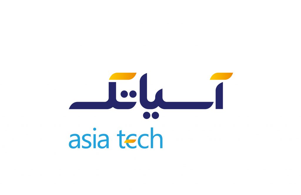
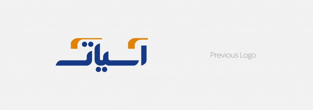
In order to improve some of the readability problems of the logotype, Asiatech’s management team assigned its redesign project to Vand International Company. The rebranding was supposed to solve the problem of not being legible of Asiatech’s Persian logotype and strengthen its aesthetic aspects.
The new logotype should guide the audience to read the second part of Asiatech’s text with lowercase, taking into account the fundamental necessity of readability. The new logotype should guide the audience to read the second part of Asiatech’s text with lowercase, taking into account the fundamental necessity of readability.
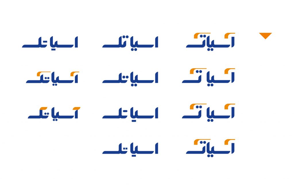
In addition, the audience should somehow understand that the tech in the word Asiatech has something to do with the technological nature of this brand. For this reason, Vand’s designers decided to use the English logotype below the Persian text to help the audience to pronounce it correctly. Also, the next strategy was to repeat the rebellious design of the Persian letter “K” in the English logotype e, so that the audience would understand that tech in Farsi is the same as tech in English, and this brand is related to the field of technology.