
Ladder Team is an art-educational institution that has defined its activities for the teenage age group. The trainers and lecturers of this institution are selected from different countries and students from all over the world have the opportunity to participate in Ladder Team projects. In the beginning, this institution operated under the name of Aftab Damon, but it needed a fundamental change in the brand. Vand International Company implemented all stages of brand redesign, from naming to formulating verbal and visual identity, etc. in this project.
Ladder Team’s activities and all their work-educational spaces are completely artistic. Theater and performance, music, street art are among the things that this collection does. Group work and cooperation is so important for this team that it somehow became the teaching method of the team. According to these two features, the Vand team created a verbal and visual identity of this institution to represent such an atmosphere.
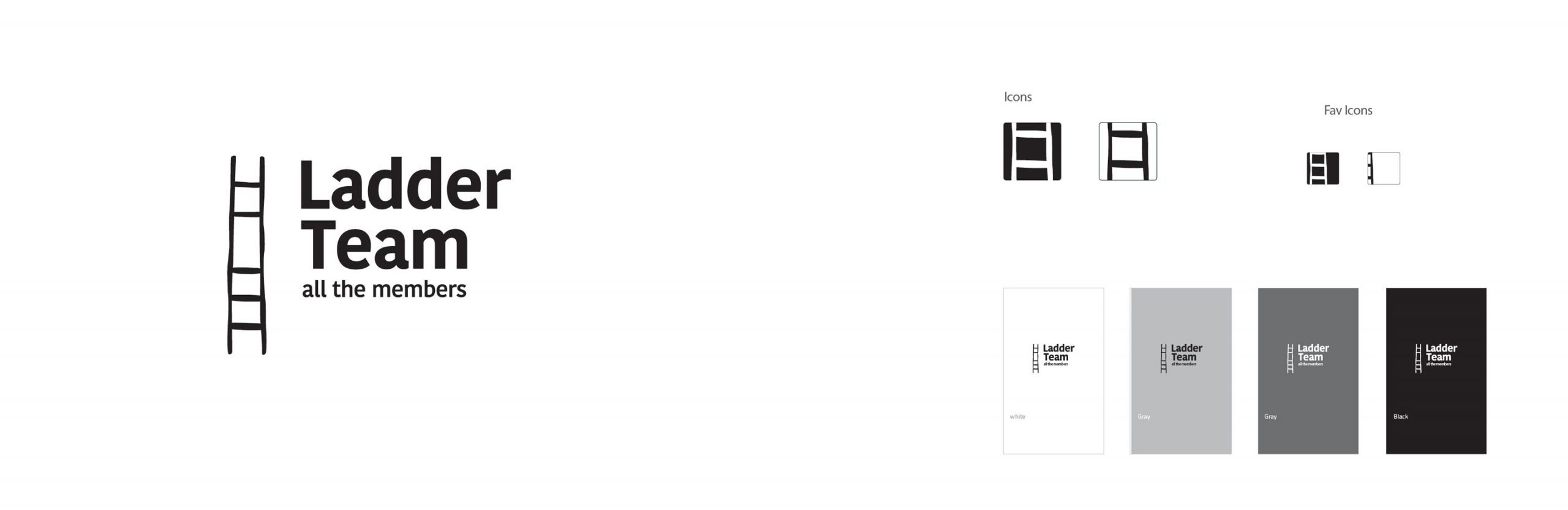
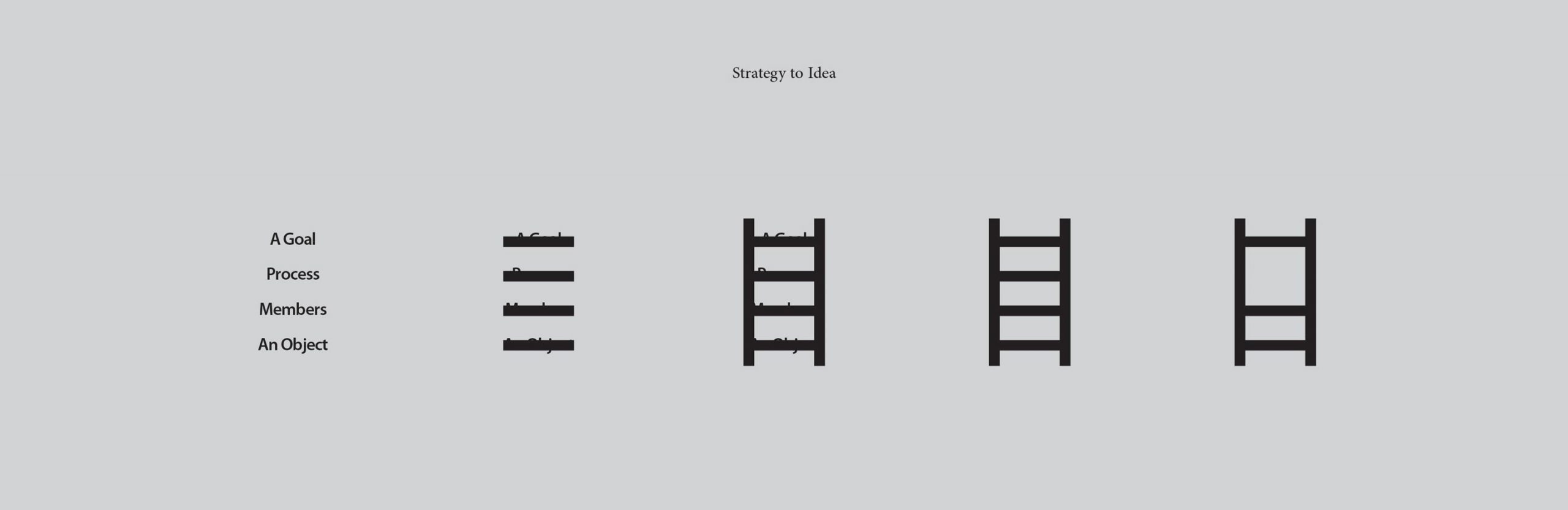
The solution that was chosen at Wand International Company was to use the symbol of a ladder for the logo of this institution, on the condition that one of its steps is removed. This strategic strategy in creating the visual identity of Ladder Team was supposed to convey the message to the audience that all members of the group are important and if one of these members is removed, the nature of the ladder will be disrupted. In other words, all steps are important for a ladder to be a ladder.
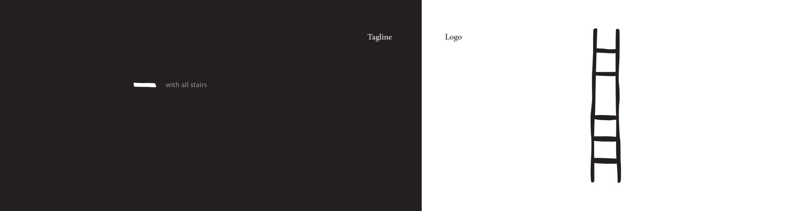
Usual methods were not used for logo design. Rather, Vand’s team built a ladder with the desired features of the project and it was photographed. In the process of combining the verbal identity with the visual identity, the name Ladder Team was chosen for this art-educational institution. To have both the ladder and to be an emphasis on teamwork. For identity coherence as much as possible, the phrase “All members” was proposed as the tagline of Ladder Team.
