Description of the problem
Mel & Moj is an Iranian brand in the field of clothing, which after about a decade of activity, today ranks among the top brands in the country. Initially, this collection offered a wide range of women’s products with criteria such as up-to-date design, high-quality raw materials and high-quality production. In spite of this history, in recent years Mel&Moj has gradually focused on the production and sale of sportswear and its popular market. The founders of Melandmoj were two entrepreneurial sisters at first, but after attracting investors, the new shareholders decided to change the position of the brand through the development of branches and stores and the production of new products. In this way, Mel&Moj was gradually changing from a casual and women’s fashion brand to a sports brand, and therefore such a change of approach should be reflected in the brand identity.
The main issue was that neither the change in Mel&Moj’s brand position was seen in the brand, nor was the brand’s identity palpable and recognizable in its products. Therefore, the most important consideration that had to be made in the rebranding project was to align the brand identity with the change in the position of the brand and its products. Although the branding strategies were written in advance, in the meetings held by Vand International Company with the managers of Mel&Moj, the Exciting brand personality and the Magician archetype were chosen for it, which also fit with the brand position (changing the brand position and moving from casual to sports style).
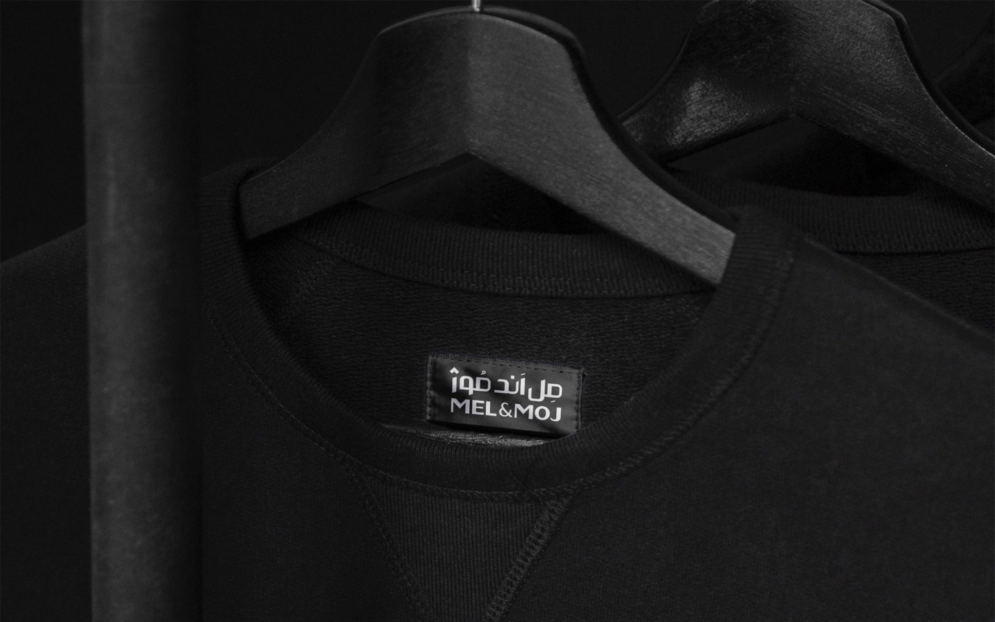
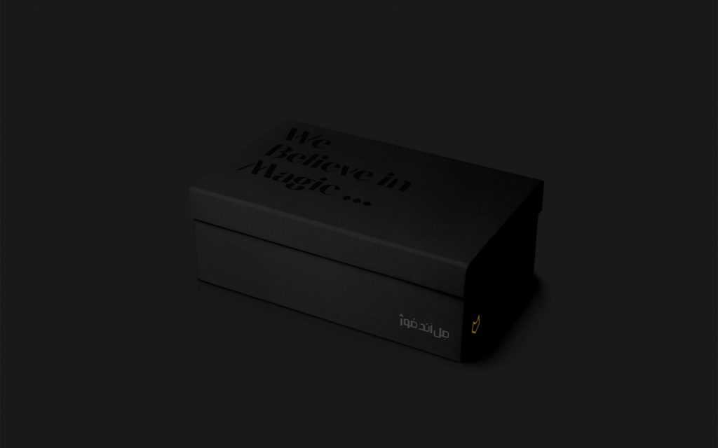
The core of Mel&Moj’s strategic identity is to be mysterious and mysterious, and mysterious designs were needed to build a magical and mysterious brand. Therefore, to answer this demand, both dark colors and shaded visual spaces were used. The logo is made as a face without any details to give more suspense. The angles of this logo are moderate, not too sharp and not too soft. In addition, this project successfully paved the difficult way of matching Persian logotype with English logotype to show the same identity. Also, this trend was developed with the slogan “We believe in miracles” as a brand tagline.
Challenges and solutions
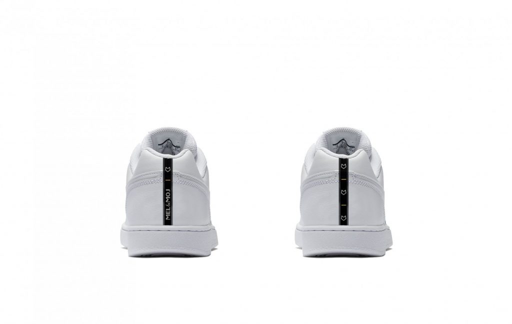
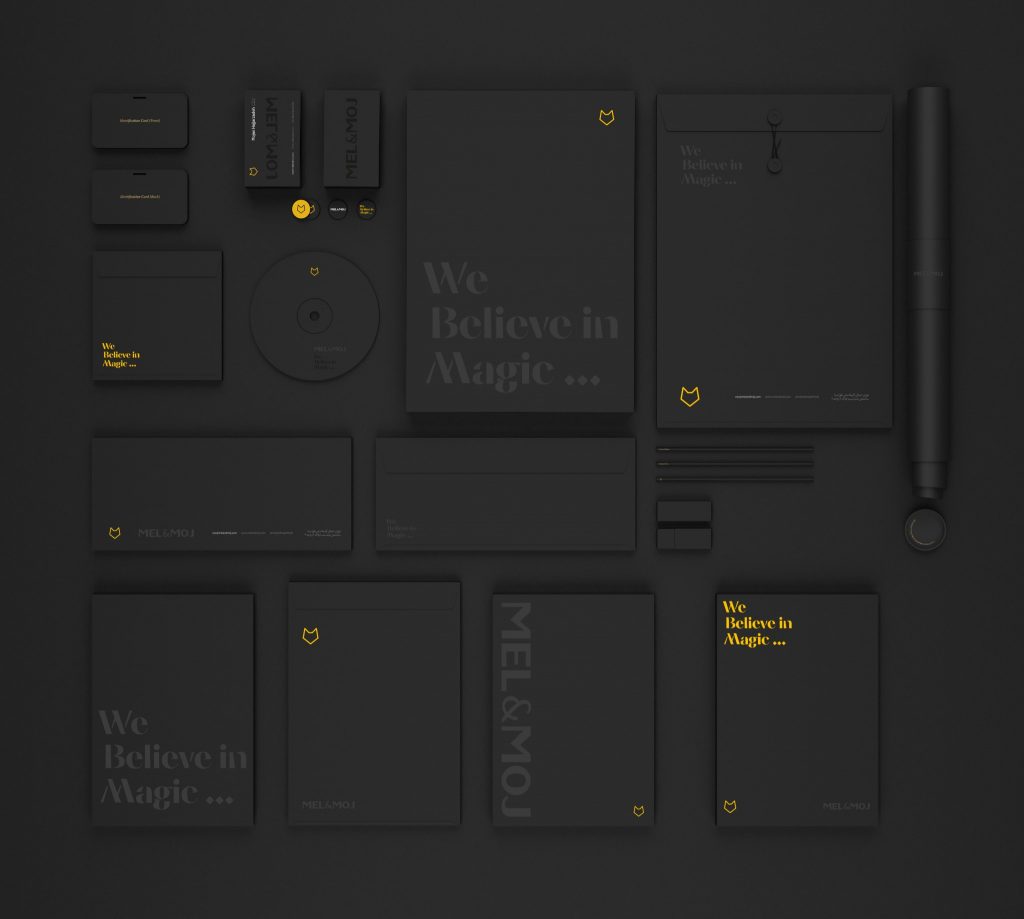
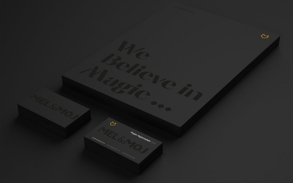
By entering the image identity design stage, due to the necessity of using the logo on the clothes, the design strategy required that both the logo and the logo should be followed. In the implementation of the designs, different routes were suggested by Wend. Regarding the shape of the logo, the initial agreement was to keep the original logo of the brand, however, it was decided that the logo should be redesigned in a way that is clearer and more specific in order to display its branding functions better than in the past. In the execution of the designs, the goal of the design team was to make the logo and typography of Mel&Moj well placed in the contact points of the brand and packaging and stand out. Therefore, the details of the designs were gradually completed. Among the contact points that were designed in this project were virtual space, letterhead and office and printed papers, invoices, customer membership card, note sheets, folders and packaging. Also, in another stage of the project, the Wend team designed the interiors of Mel&Moj stores based on the brand’s new position.
Results and effects
Mel&Moj’s rebranding project redesigned the visual identity of this brand in accordance with its real position. As a result of the successful branding, Mel&Moj was chosen as the official sponsor of the Iranian caravan in the Tokyo Olympics. In addition, the designs of this project were sent to the World Brand Design competition by the Wend company, which received attention. In this event, Design Vand entered the final stage of the competition as one of the candidates for the main prize.
Project partners:
Mozhgan Hajarzadeh – CEO
Khayyam Askari-Strategist
Vend team members:
Touraj Sabrivand-design strategist
Jalil Nourbakhsh – strategist
Hamed Shujaei-designer
Nima Wafabakhsh- designer
Surna Ahmad-designer
Project execution time: 2019
