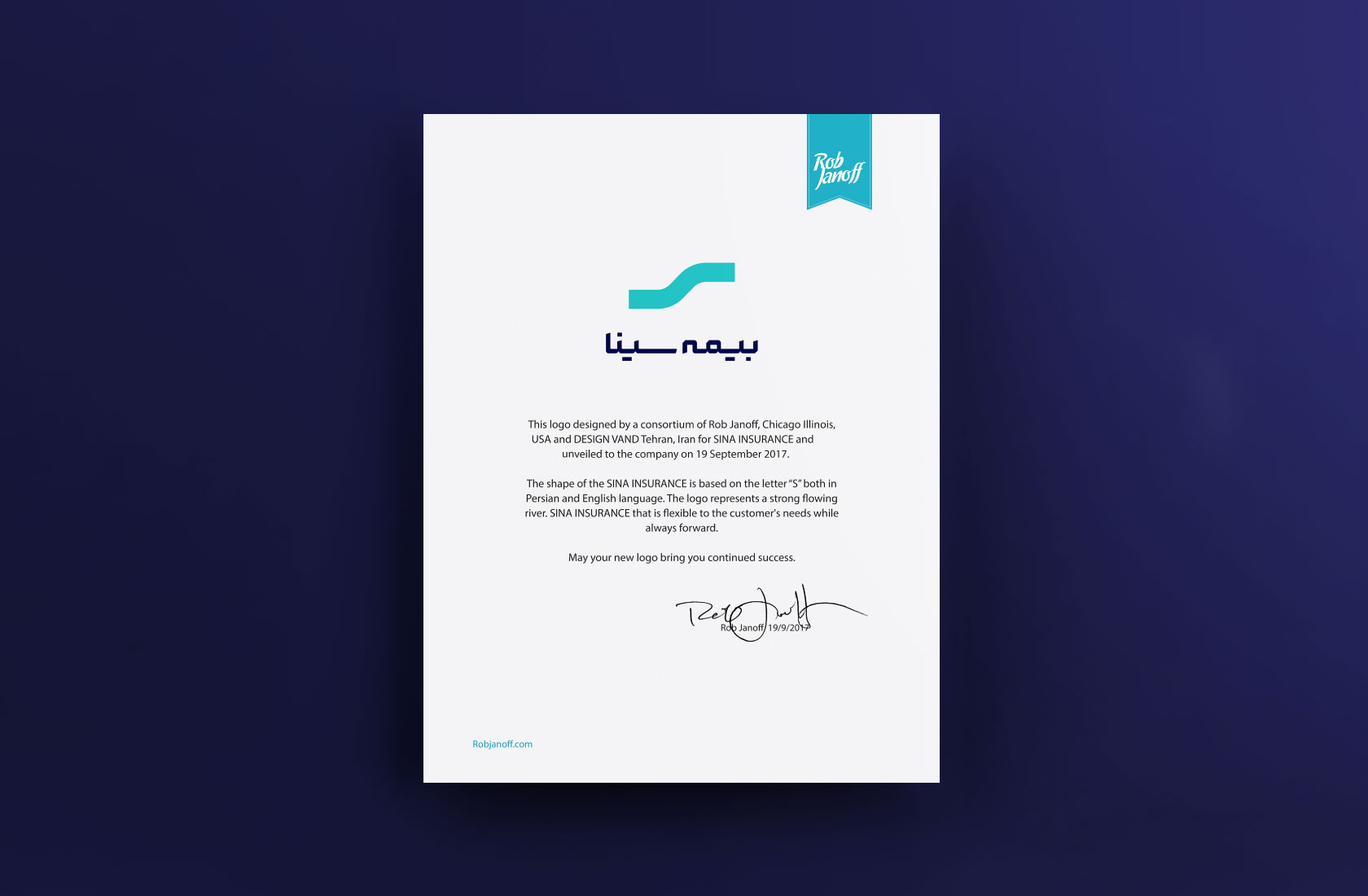

“Sina Insurance started a multifaceted transformation program with the participation of Vand to become a bold, reputable and customer-oriented insurance brand with ambitious goals in the country’s insurance industry. This project was carried out in collaboration with Rob Janoff – the designer of Apple’s logo and an international colleague of the VAND team – and the designed logo of Sina Insurance won the best brand awards competition in Dusseldorf, Germany, one year after its unveiling.
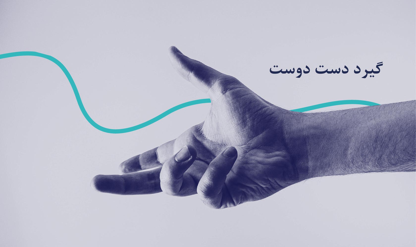
“How do you revive a brand that has serious reputational issues and is dealing with serious legacy issues? Our solution was: Sina Insurance needed a completely new identity and we had to start its reconstruction from the ground up. A clear sign of change was a completely new verbal and visual identity that served as a blank slate and a new opportunity to introduce the brand to the audience. The branding strategy of Sina Insurance was developed based on the key variables of the nature of the brand, i.e. friendship, intimacy and soft communication (inside and outside the organization). As part of the branding campaign, the new slogan “Gird Dast Dost” was chosen for Sina Insurance to convey this message in a strong link with the Brand Promise: “In all its communication activities, Sina Insurance claims friendly support so that customers can walk on their desired path without fear of accidents and with the support of the effective support they receive.”

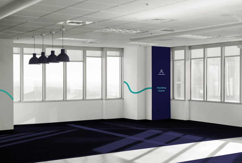
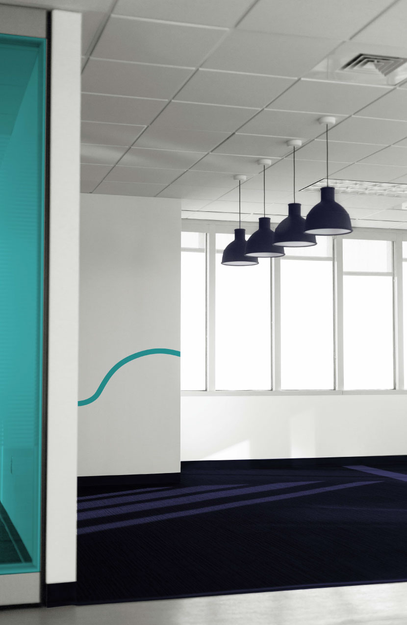
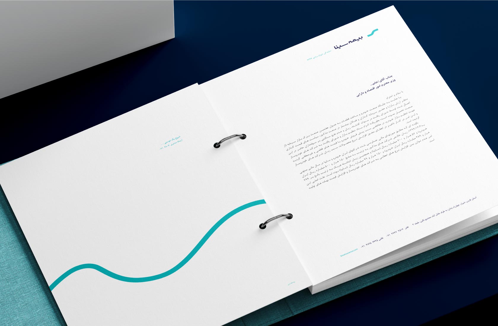
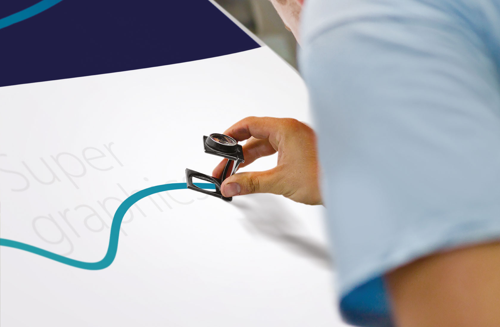
“Visual spaces of Sina Insurance were designed very simply, and dark blue, white and turquoise colors were chosen as the main colors. The dark red color showed the seriousness and formality of Sina Insurance well, while the lines and supergraphics were designed very smoothly to reflect the desired intimacy in this new identity. Softness and simplicity were fully reflected in the Sina insurance logo. We examined different Sinas in Iranian writing styles and calligraphy, and in the logo that we finally made for Sina Insurance, a design of the letter “S” (the first letter of “Sina”) is used, which is very similar to the English letter (S). Was.”