
Asiatech is the first company to remove the speed limit in intranet communication. Asiatech, as the most complete provider of communication solutions in Iran, today offers a comprehensive range of communication solutions to home and corporate subscribers. This large company has more than 700 active employees and has the most extensive fixed communication infrastructure in the private sector.
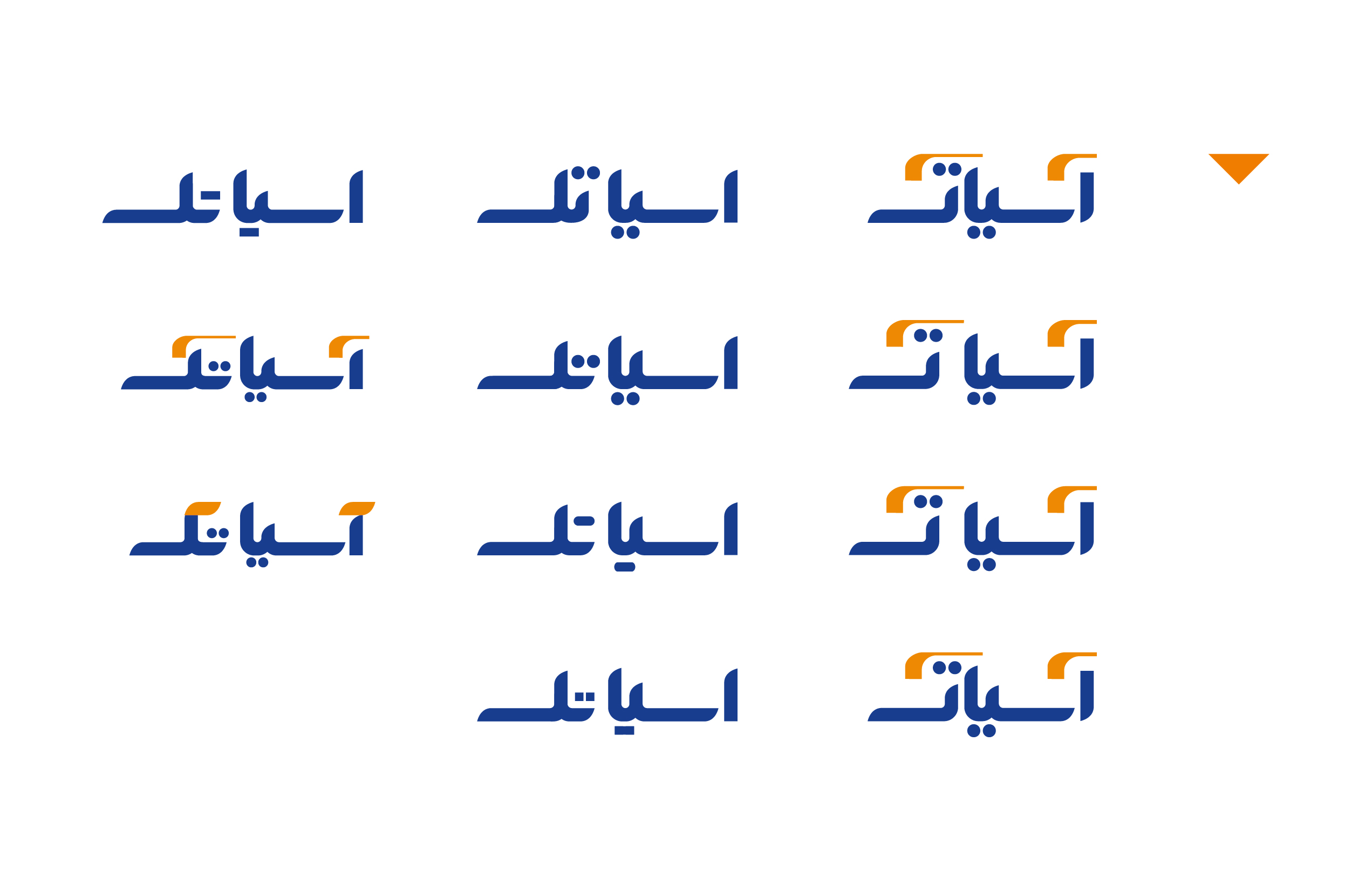
In order to improve some of the readability problems of the logotype, Asiatech’s management team assigned its redesign project to Vand International Company. The rebranding was supposed to solve the problem of not being legible of Asiatech’s Persian logotype and strengthen its aesthetic aspects.
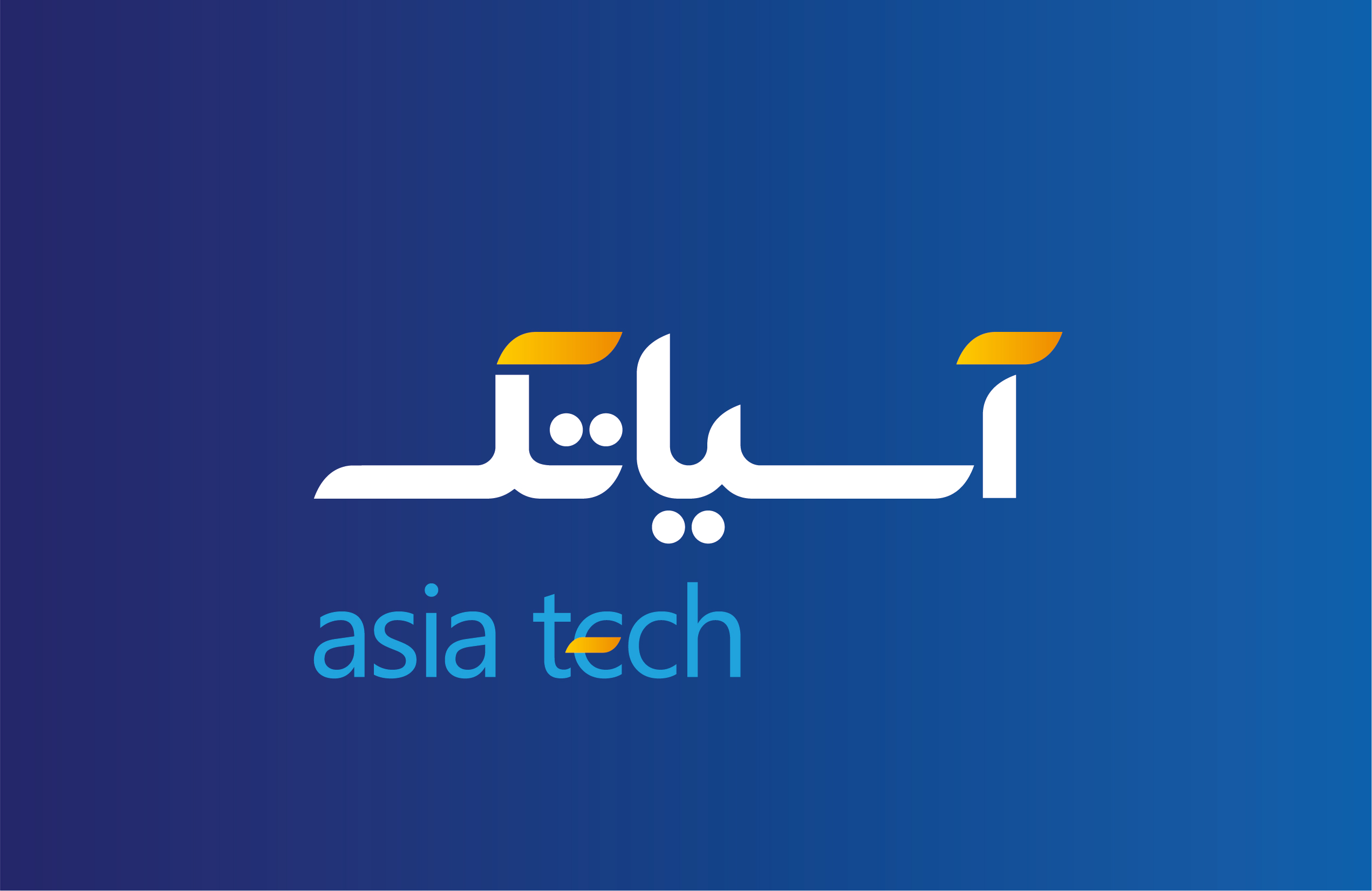
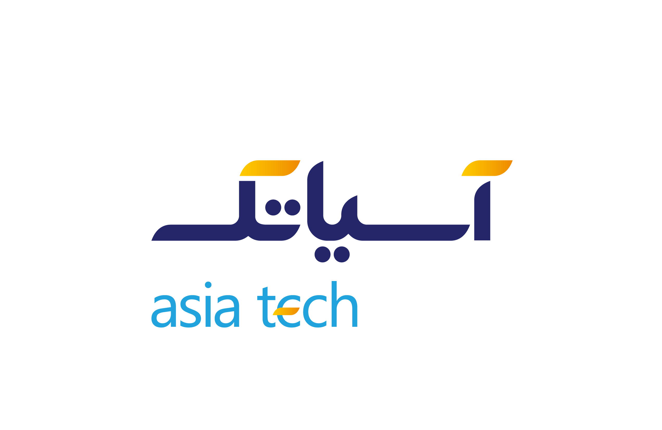
The new logotype should guide the audience to read the second part of Asiatek’s text with lowercase, taking into account the fundamental necessity of readability. The new logotype should guide the audience to read the second part of Asiatech’s text with lowercase, taking into account the fundamental necessity of readability.
In addition, the audience should somehow understand that the tech in the word Asiatech has something to do with the technological nature of this brand. For this reason, Vand’s designers decided to use the English logotype below the Persian text to help the audience to pronounce it correctly. Also, the next strategy was to repeat the rebellious design of the Persian letter “K” in the English logotype e, so that the audience would understand that tech in Farsi is the same as tech in English, and this brand is related to the field of technology.
