Description of the problem
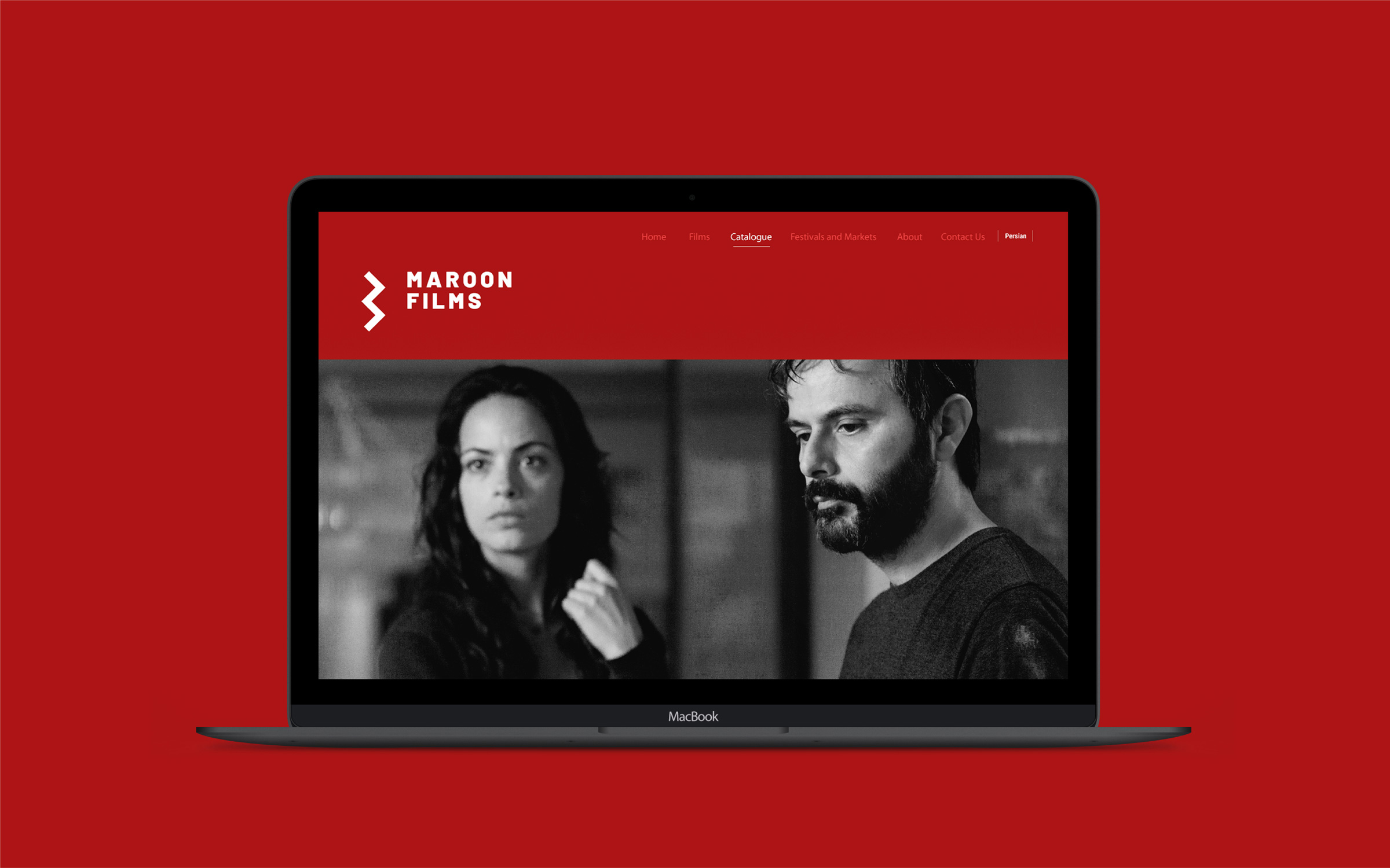
Maroon Films is a startup for broadcasting and introducing independent Iranian films to international platforms. Especially those movies that narrate the lives and concerns of women. The activities of this startup have made several Iranian films enter prestigious international festivals. The specific issue of Maroon Films, which was discussed with us in the initial meetings of the project, was the design of a visual identity consistent with the gender and nature of the brand’s activities.
Challenges and solutions
Although Maroon Films has a business identity due to the nature of film distribution and sales, it is mostly related to artists. Therefore, what was essential for us was to find the artistic personality of Maroon Films in the logo. We had to design the logo in a way to show that Maroon Films is different from the purely business and commercial companies in the film distribution industry. Therefore, Maroon Films needed a strategic identity that, while being international, also has a bold artistic aspect. Vand’s team’s design strategists decided to focus on the “attention economy” in the designs, prioritizing the audience’s attention over the aesthetic elements of the logo.
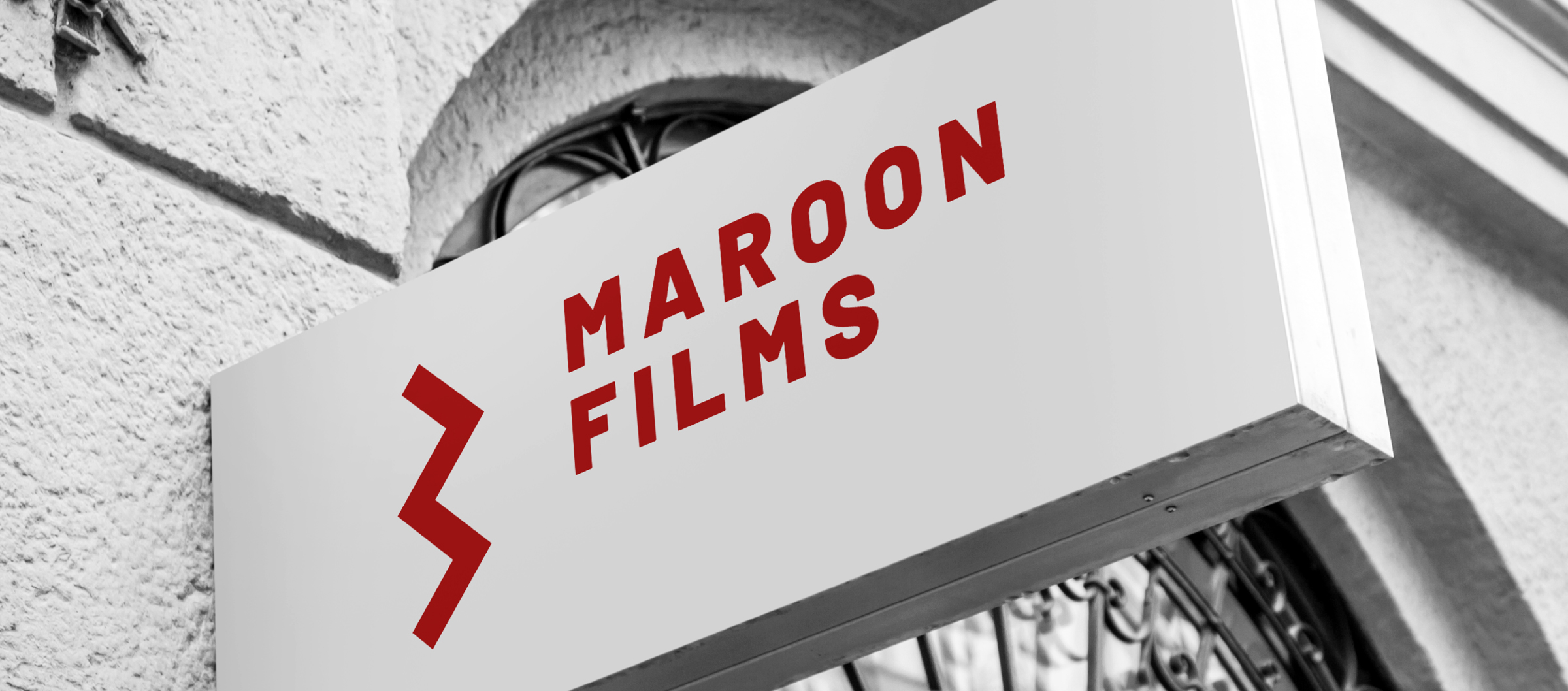
Therefore, among the paths ahead of the project, a path was chosen for the design that would create a higher engagement capability for the eyes and senses of the audience. The logo design was inspired by the similarity of W and M, the initial letters of the three main concepts of the brand, namely Maroon /Movie/ Women. Finally, the logo was designed to have the maximum similarity to both the letters M and W with the simplest possible shape.
By rotating the letter M by 90 degrees, we made a simple logo that was not at all similar to stylish and beautiful logos. Furthermore, we wanted the letter M to have an aesthetic ugliness. According to Wendt, this aesthetic ugliness helped give the company and its identity an artistic vibe.
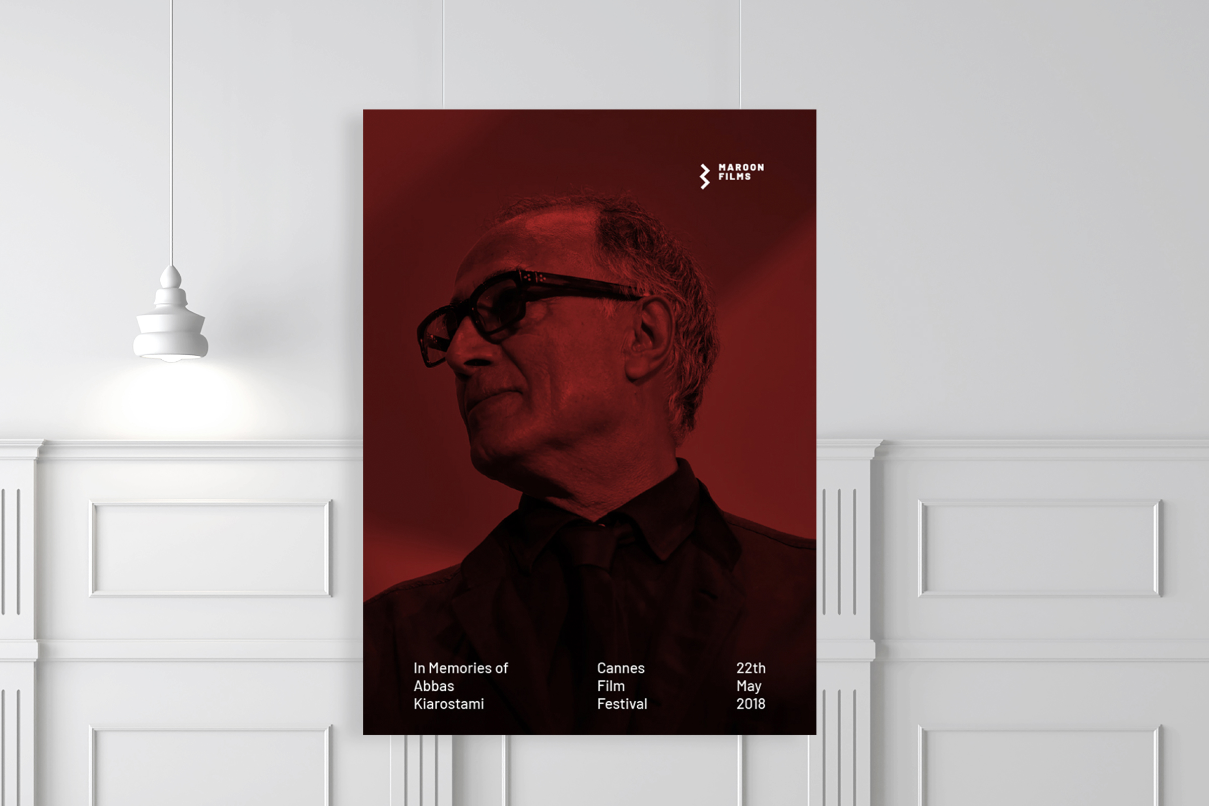
Maroon in English is equivalent to burgundy. Therefore, we used this color in the design of the image identity of Maroon Films. Determining color is one of the most important aspects when designing a logo or creating a brand. We don’t choose colors in projects just because we or the brand managers like it. Colors should represent company values and brand personality in collaboration with other visual identity elements, and the color chosen for Maroon Films visual identity had this feature well.
Results and impacts
As Acker says, when it is difficult to differentiate products and services, a symbol can be the central element of brand equity or the main distinguishing feature of a brand. The Maroon Films logo, as a part of the overall meaning of the brand, was given a unique, artistic, and impressive architecture and stood out as the most important distinguishing element of this company in the bustling cinema industry. Logos are very powerful and if designed correctly, they succeed in creating visual communication and cross international boundaries and language barriers.
The new logo of Maroon Films also attracted attention in the international arena and answered the needs of this brand well. Because the basis of its visual identity design was the strategies that supported the brand values.
Toraj Sabrivand, the design strategist of the Vand team, was praised with the Maroon Films logo in the selection list of the research book “One Hundred Years of Graphics in Tehran”. This book is an introduction to one hundred faces of graphic design in Tehran along with one of their prominent works that was published in 2019.
“Vand’s design for Maroon Films is consistent with the work identity of this brand and its atmosphere. With a deep understanding of the work and performance of Maroon Films as a film distribution startup focused on women in cinema, Vand did a minimal and unique design for this brand; The similarity of this logo to the first letter of Maroon, as well as the first letter of the word woman in English, the coloring of this logo and the color used in the space of the designed material, all help Maroon Films to come closer to its defined identity.“
Samin Mohajerani-CEO & Founder of Maroon Films
Maroon Films partners:
Samin Mohajerani (CEO)
Team members:
Toraj Saberivand (Design Strategist)
Jalil Nourbakhsh (Strategist)
Ali Jamali (graphic designer)
Nilofar Sharifi (graphic designer)
Project process: design strategy/ Visual identity
Project execution time: 2019