Description of the problem
Mofid Securities is one of the most well-known businesses in Iran’s capital market. A brand that, after establishing its position in the domestic market of Iran, sought to be present and operate at higher levels and to internationalize its activities. According to the managers of this company, the lack of distinctiveness of their visual identity and the excessive similarity of the logo of that useful time with the logo of the London Stock Exchange made the presence and activity of this brokerage at the global level dangerous. After formulating strategies that fit the new needs of this company, one of the useful strategic decisions was the rebranding of the company’s visual identity. After discussing the issue with the Wend team and holding initial meetings, we formulated Benefic’s need under two topics: First, the reflection of Benefic’s unique approach and position in the new visual identity that fits the global realities of the capital market. And secondly, integrating the visual identity and developing it in all touch points.
Challenges and solutions
The evaluation and opinion of Vand experts indicated that Mofid Brokerage is the leader of the capital market in its field of work, the basic strategy of visual identity design was to be able to represent this leadership and power. Therefore, the following two strategies were followed in designing a useful visual identity:
Using red and green color instead of the previous red color
Choosing the concept of the material of the cow and the red logo design
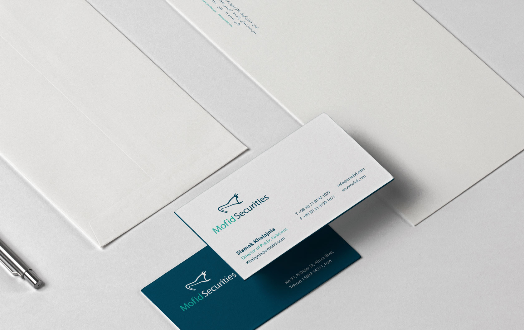
The choice of fresh colors for a useful image identity had two main bases: green color in the capital market is a sign of growth. On the other hand, based on the research and survey conducted to evaluate the audience’s perception of useful agency, most of them considered the color blue to be useful. Therefore, in addition to the green color, a dark red color was chosen for Mofid, which indicated the competence and weight of the market leader and gave it more dignity.
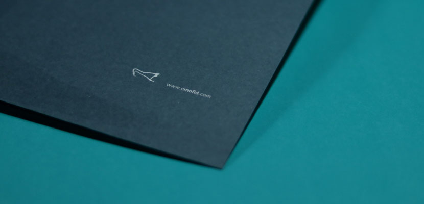
The selection of the concept of “stock market cow” in the logo design was based on the power of this concept in associating components such as strength, dignity and peace. Unlike conventional stock bulls that are depicted as angry or attacking, the design of the bull was chosen for Mofid, which, while possessing majesty and power, also evoked peace.
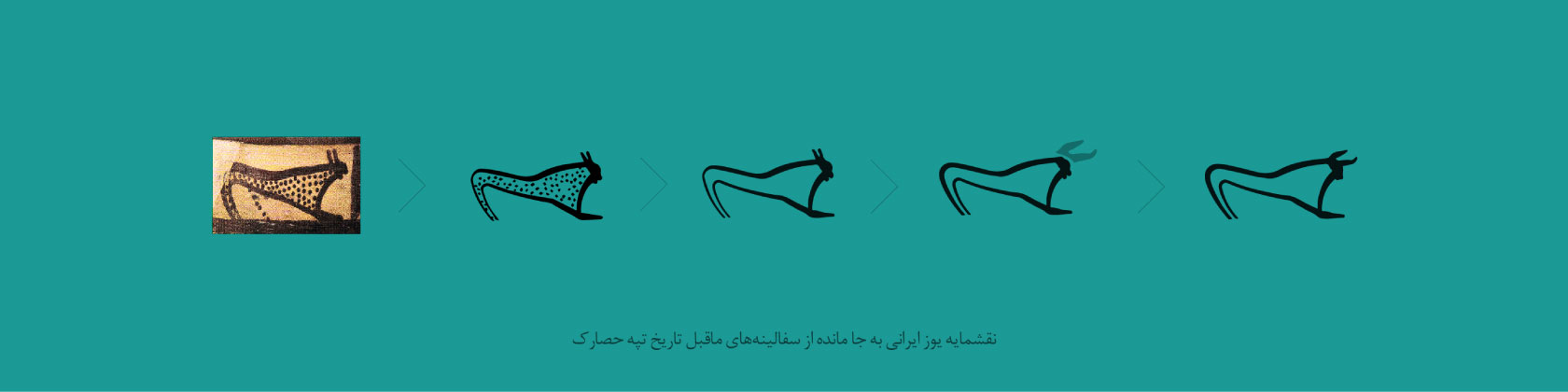
Various designs of cows were considered for the symbol of the stock market, but in the end, an ancient-Iranian design inspired the current logo of the useful brokerage. A design derived from the image of ancient animals carved on pottery discovered in the ancient area of Tepe Hesar (6 thousand years old). Although the initial design that was chosen in the clay motifs was an ancient animal similar to a cheetah, but in the process of designing the useful emblem, the image of the animal came close to the familiar design of the cow.
We believed that there is a strong semantic connection between the useful nature and the design of the ancient animal. In the original sketch, the animal has its head down and although it appears still, it seems as if it is about to charge forward with full force to take over the battlefield. As in today’s capital market of Iran, the name Mofid Brokerage inspires such a powerful image.
It was very important for us that the original design was Iranian. We used the historical German related to the art of ancient Iranians in the design of the emblem, but not with its old and ancient character. Because the dark color, the flatness and the way used in the design of its details are completely modern. The new coat of arms tries to keep simple lines and at the same time has a fresh interpretation of this ancient character that brings it closer to the shape of the cow as a universal symbol.
Results and impacts
What useful brokerage gained from the rebranding project was the acquisition of the most powerful stock symbol while being weighty and dignified, and brevity and simplicity while distinguishing. The cow is a well-known and universal symbol in the capital market, and bull statues have been built and installed in front of many of the world’s major stock exchanges. The bull market is a metaphor to describe the positive and growing trend of the capital market, and in the minds of all the stakeholders of this market, the bull is a representation of success and superiority.
Despite the global importance of the cow symbol in the capital market, none of the Iranian companies had used the cow symbol before Mofid. By turning this void into an opportunity, Vand used the most important stock symbol for a useful visual identity and created a distinctive value for it.
Also, the design language and design of useful brokerage influenced the spirit and atmosphere of the capital market. After the unveiling of this strategic, distinctive and impressive design, the work result was so popular in the financial market that considerable cooperation requests poured in to the Vend team. The common interesting point between these requests was the repetition of the sentence: “We also will be useful!”
The in-depth interviews that we conducted with Iranian capital market activists show that, in the opinion of many Iranian capital market activists, the new visual identity of this brokerage has given it a prominent position compared to its competitors, and many of the interviewees admitted that it is a useful brokerage as well. It has enhanced its branding capabilities and highlighted its distinction as a world-class brokerage.
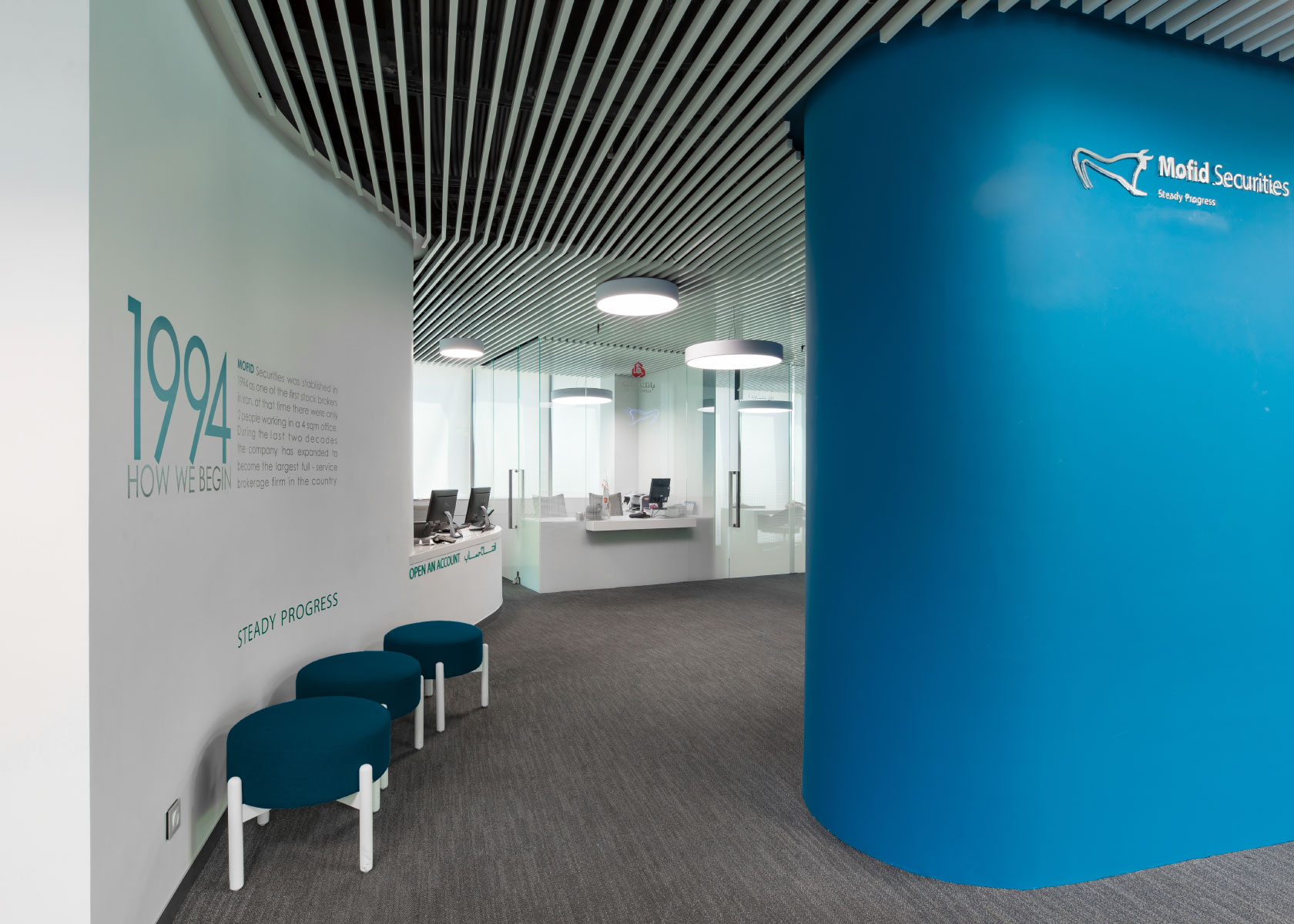
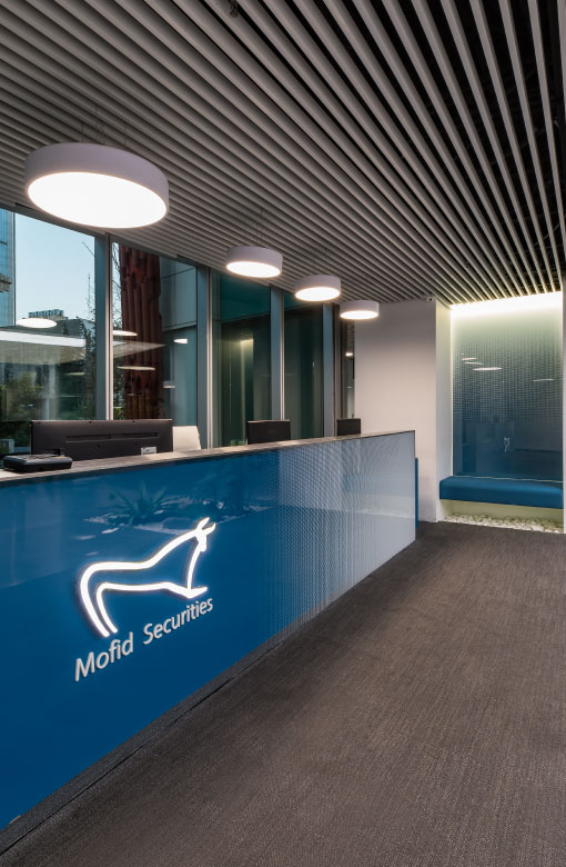
After a while, the new image identity became useful to the target community of 10 million people. According to Mofid Securities managers, by implementing visual identity in the entire organization, from letterheads to folders and envelopes and the internal space of this company, the target audience receives this message, which is on the side of a large and powerful agency.
One of the other important effects of this project is the creation of a success story referring to the Iranian identity in designing the image identity of an Iranian brand. In Iran’s art treasure, there was a flawless design of an ancient animal that had been dusted and forgotten; We pulled it out from the depths of history and used it in the visual identity of one of the most modern Iranian companies. rather than with distaste.
Let’s make a plan for the 21st century, we referred to history and chose the best taste. In fact, a stylish prehistoric designer designed the useful badge.
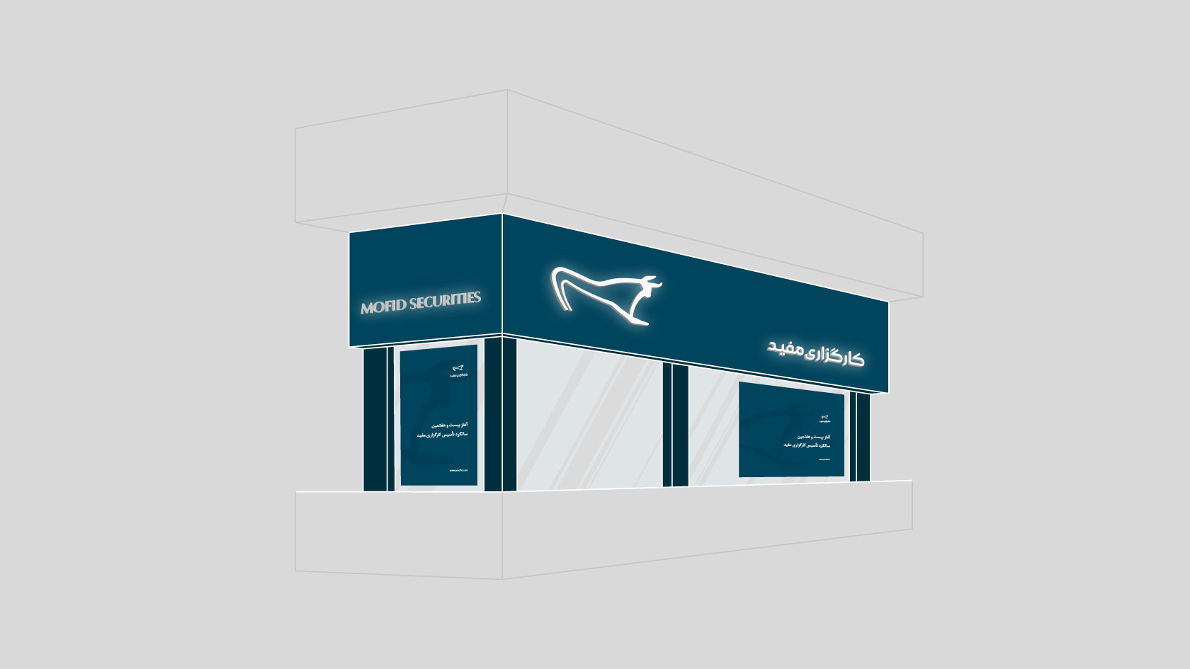
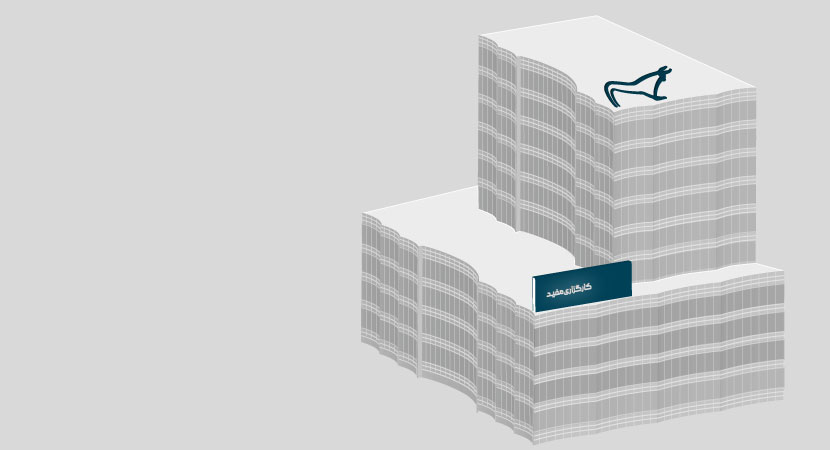
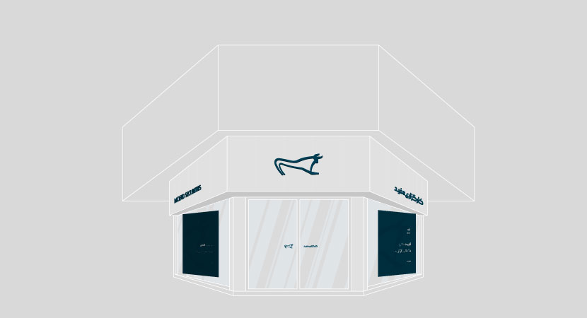
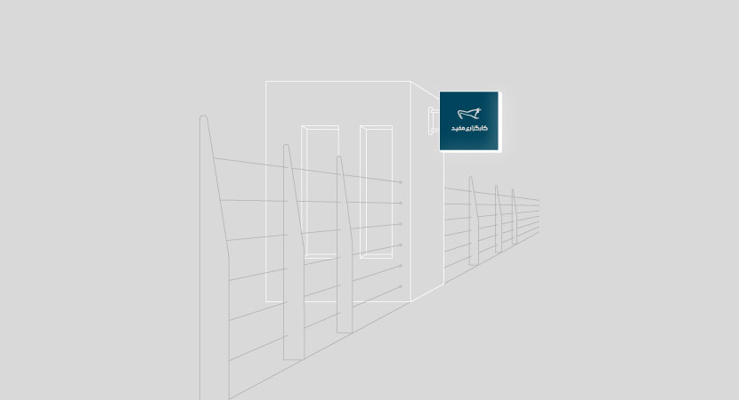
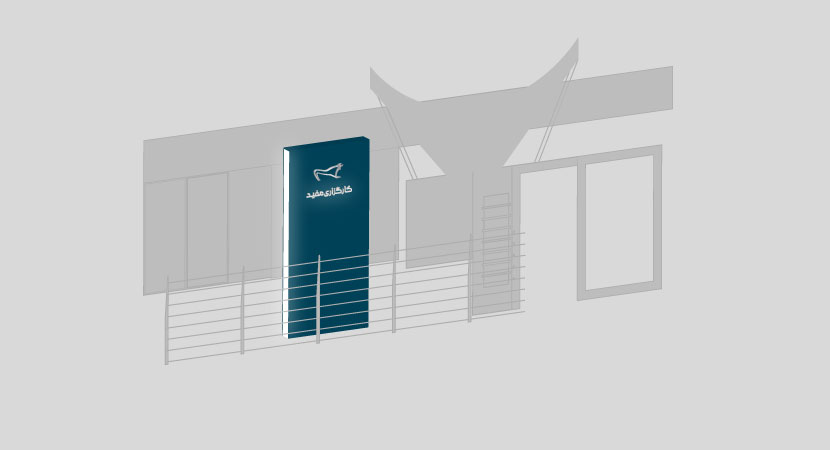
The relationship between Vend and useful brokerage is still tight and close. After 6 years (year 1400), in the form of a new project, in addition to redesigning the logotype or the text “useful brokerage”, the signs of the brokerage branches were designed, and now the signs of all Mofid brokerage branches in Tehran and other cities have been integrated.
In the design of the green color signs of the branches, which Farabi Brokerage had used to its maximum capacity in the capital market, it was abandoned and a dark color was used instead. On the other hand, white color was used for the useful sign and the writings below it. The new composition and the use of a single color in the paintings are of great design importance.
Mofid Securities associates:
Hamid Azarakhsh – founder
Hadi Mehri – CEO
Maitham Khairkhah – market development manager
Team members:
Toraj Saberivand (Design Strategist)
Ali Jamali (graphic designer)
Nilofar Sharifi (graphic designer)
Project process: design strategy/redesign of brand visual identity/comprehensive brand book compilation
Project execution time: 1394