Description of the problem
Nexa is a well-known company in Iran’s construction industry. This company works with well-known architects and is an investor and employer of luxury and modern construction projects with a different and unique style in architecture. After several successful projects and receiving awards in Iran and the world, the managers felt the need to revise the strategies and improve the image identity of the brand. Ensuring high penetration among existing customers, Nexa looked for new markets and changes to ensure the success of the next wave of growth. Nexa construction group entrusted the rebranding project to Design Wend consulting company after compiling its strategic brand documents.
Challenges and solutions
The challenge was clear: “How to define an ownable position for the brand? And how can Nexa’s goals and new position be expressed and brought to life with a new visual identity so that it reflects its spirit and intention?”
Based on this question, Nexa’s design strategy was developed step by step based on the watch model (link). Wend conducted various research studies to inspire the company’s development and new brand identity. We interviewed Nexa stakeholders, clients, architects and consultants, and examined corporate competitors and emerging startups inside and outside the category. This research pointed out an important insight: although “customer care” is a general feature of the country’s construction industry, including Nexa, Nexa’s distinction from other market actors was defined in “modernity” and prominence of the “architectural” element.
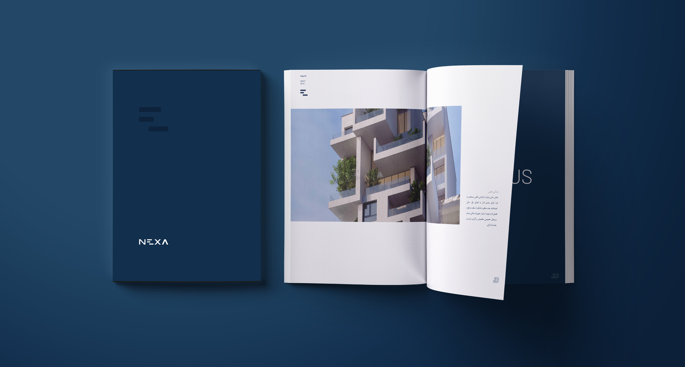
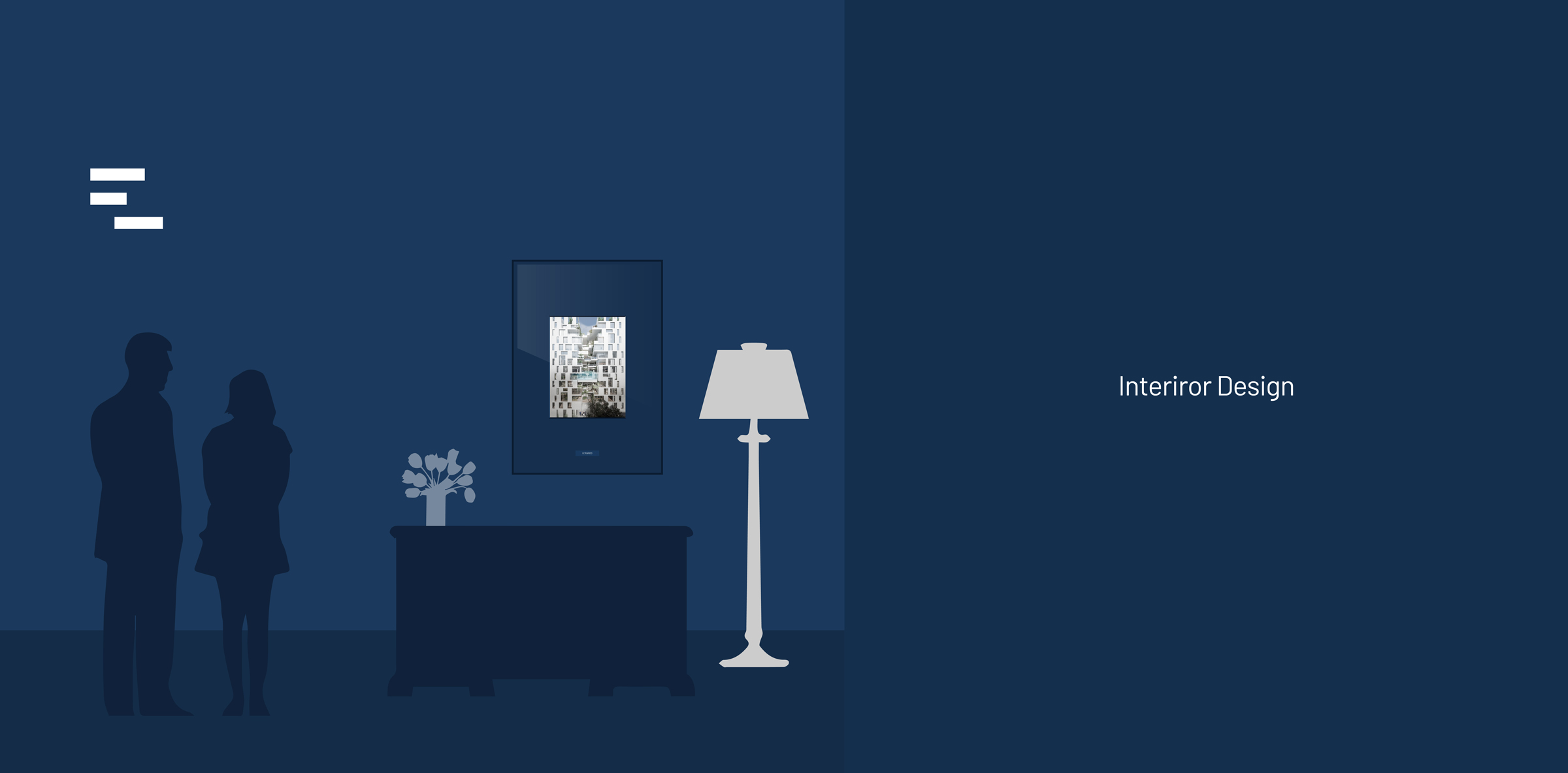
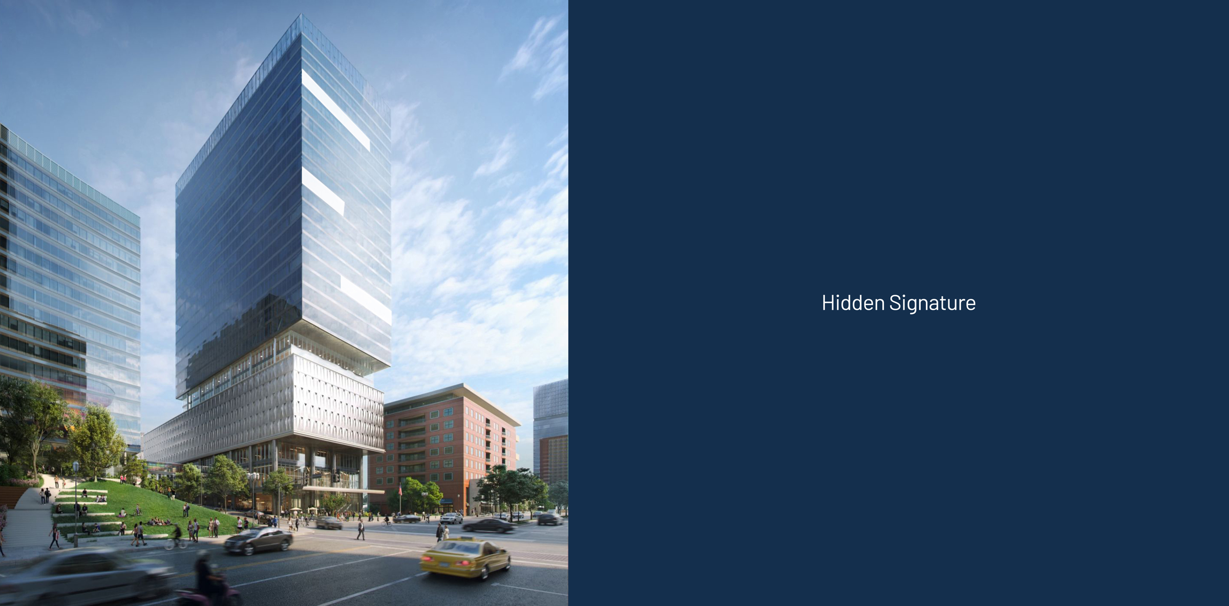
The focus of Nexa’s rebranding was on the key statement that the identity of this brand should evoke the personality of an architect rather than representing a luxury and glamorous company like other competitors. The market study said that most competitors use yellow in their identity, so Nexa’s color identity had to be exactly on the opposite spectrum. The three suggested options were dark purple, dark blue-green, and navy, from which a single color of navy was chosen.
Analyzing Nexa brand personality based on Jennifer Aaker’s model, a combination of hidden traits revealed its essence. Features such as self-confidence and leadership, formality and seriousness, contemporaneity and having an architectural character that lead us to choose the design strategy. Minimalist was the guide for Nexa.
After the strategies were clarified in the watch model and Nexa’s brand identity was determined in the Aker model, the project entered the design implementation stage.
The process that Wend always goes through in designs is to draw two converging and diverging paths based on the Double Diamond pattern (link). In the sense that the project is placed at the zero point to determine which are the appropriate designs.
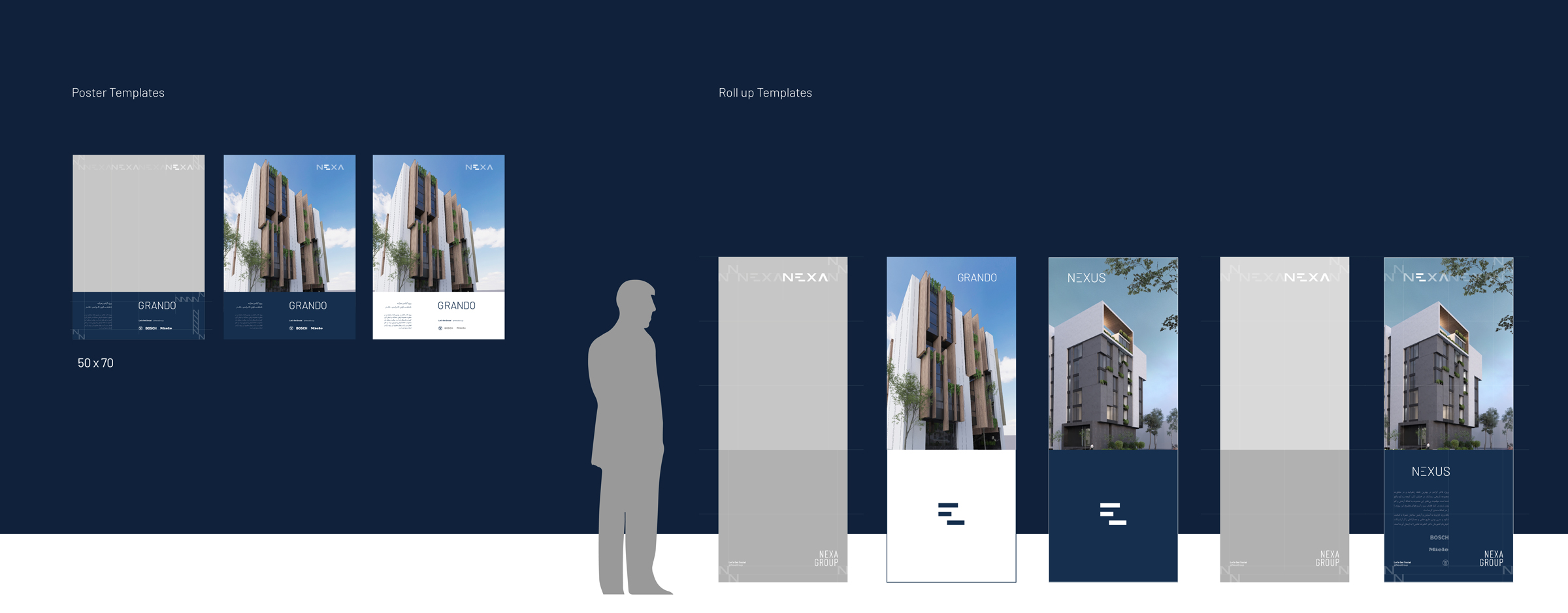
Through the analysis of converging and diverging paths, finally the Nexa logo was designed based on focusing on the horizontal lines of the letter E, and then it was developed into Persian and English logotypes and supergraphics and the names of various projects of this company.
Results and effects
The path followed in the rebranding of Nexa aligned and integrated the basic strategies that were already developed in the Nexa construction group with the image identity of this brand.
One of the important results of the project was to reveal the aspects of Nexa’s personality through the intelligent analysis of the point of commonality (Point of Parity) and the point of difference with competitors (Point of Difference). A smart strategy in branding means discovering and intuition in the hidden layers of the nature of the brand and pulling it to higher and visible layers; So that the real personality of the brand can be understood and received by the audience in the image assets. We provide brands with the opportunity to meet their forgotten or undiscovered dimensions. In the Nexa branding project, we found that the conventional identity of the construction industry, which means emphasizing luxury and excessive expressionism, is not consistent with Nexa’s existence. Architecture in a modern way is the most important feature of the buildings that are built by Nexa construction group, so we highlighted this feature in Nexa’s image identity design strategy. We showed that Nexa is not a construction company belonging to yesterday or from a distant future, which makes strange and non-binding proposals; Rather, it is like a beautiful architect who uses today’s taste for today’s citizen. Simplicity in the designs, the use of dark color and the minimalist spirit governing all contact points, which are all collected in Nexa’s comprehensive brand book, were our strategic solutions to tell this issue and create more differentiation from competitors.
Nexa’s rebranding project created a wave of effects in the issue of visual identity in the construction industry. It can be said that Nexa was the first company that thought about branding in this industry. After the unveiling of the new identity of this company, many other construction companies also paid attention to their branding and visual identity.
Nexa partners:
Daniyal Baranian – CEO
Shahrukh Davarnia – Marketing Manager
Team members:
Jalil Noorbakhsh (Strategist)
Toraj Saberivand (Design Strategist)
Ali Jamali (graphic designer)
Nilofar Sharifi (graphic designer)
Phases of the project/project process: design strategy/redesign of brand image identity
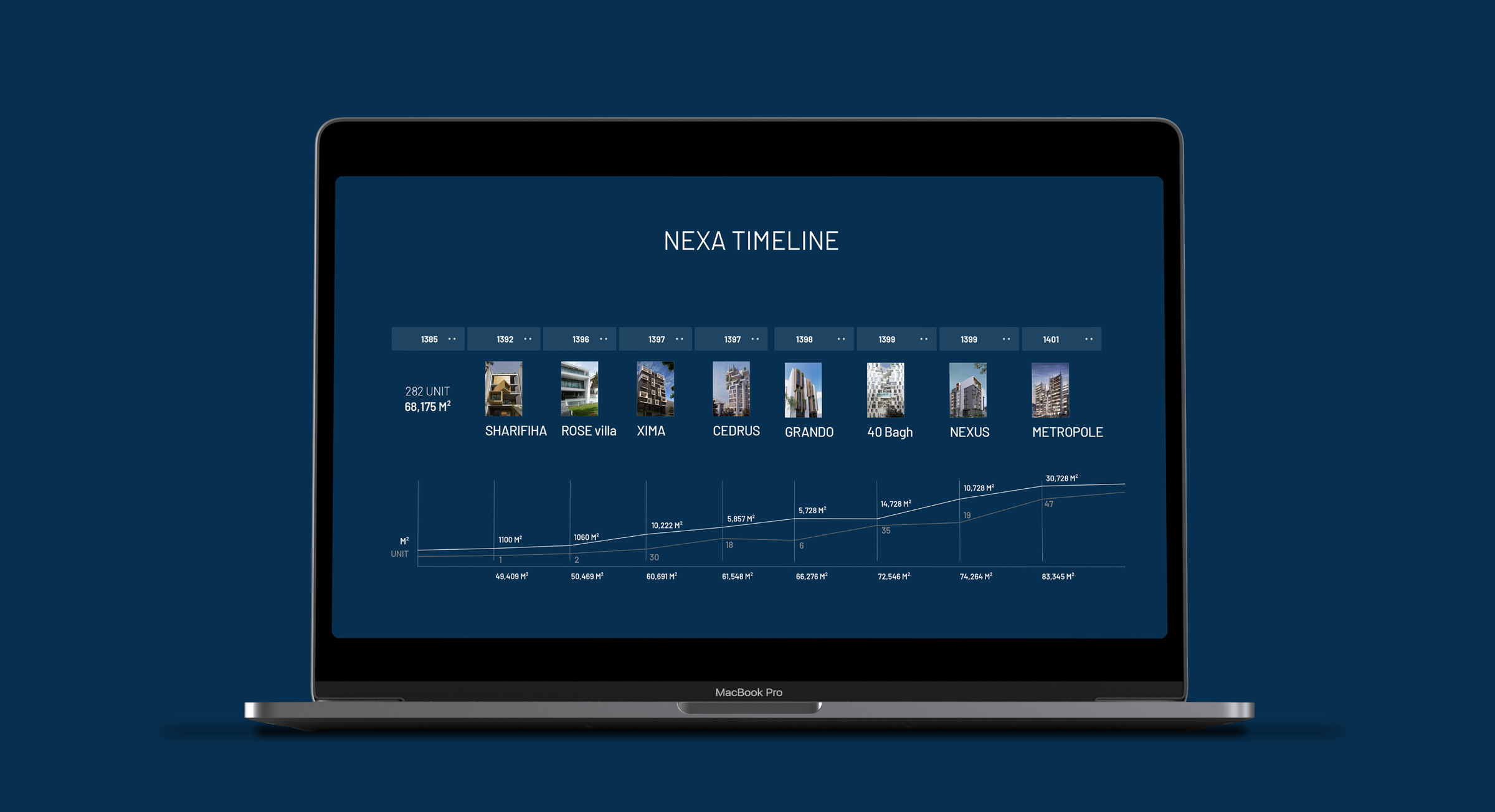
Project execution time: 1397