Description of the problem
Pronexo, under the brand name “Uzhan Rayan Communication”, is a company specializing in the field of network, which meets the needs of businesses and organizations in all aspects of consulting, supply, warranty, and after-sales services.
Pronexo, with its physical stores and agencies, is a well-known brand today, but 5 years ago (year 1996) it was at the beginning. At that time, Pernexo’s goal was to gain a larger share of the highly competitive network equipment import market. Reaching such a position had requirements, one of which was branding and creating a suitable identity for this company. The formulation of the brand strategy had already been done and Pronexo’s managers entrusted the visual identity design to Wend International Company.
Challenges and solutions
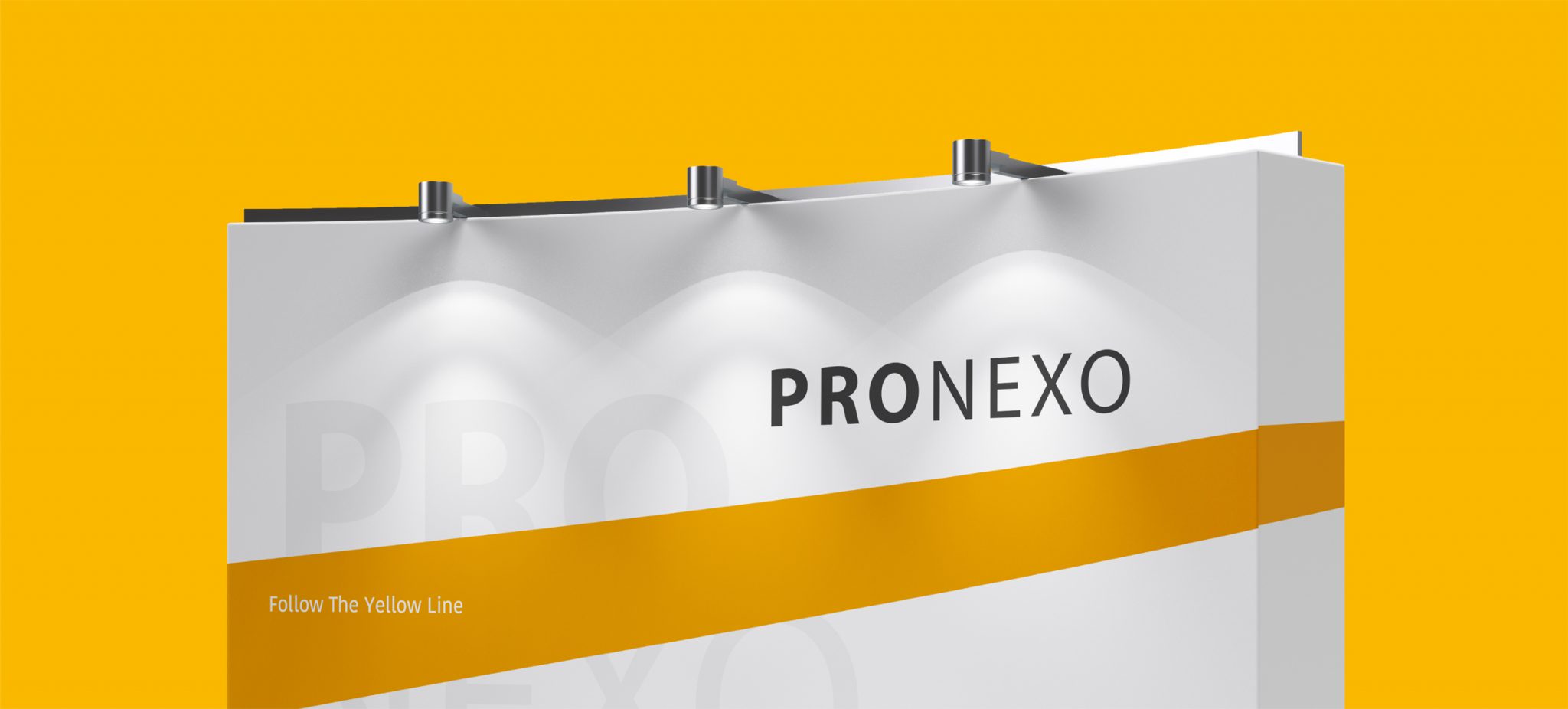
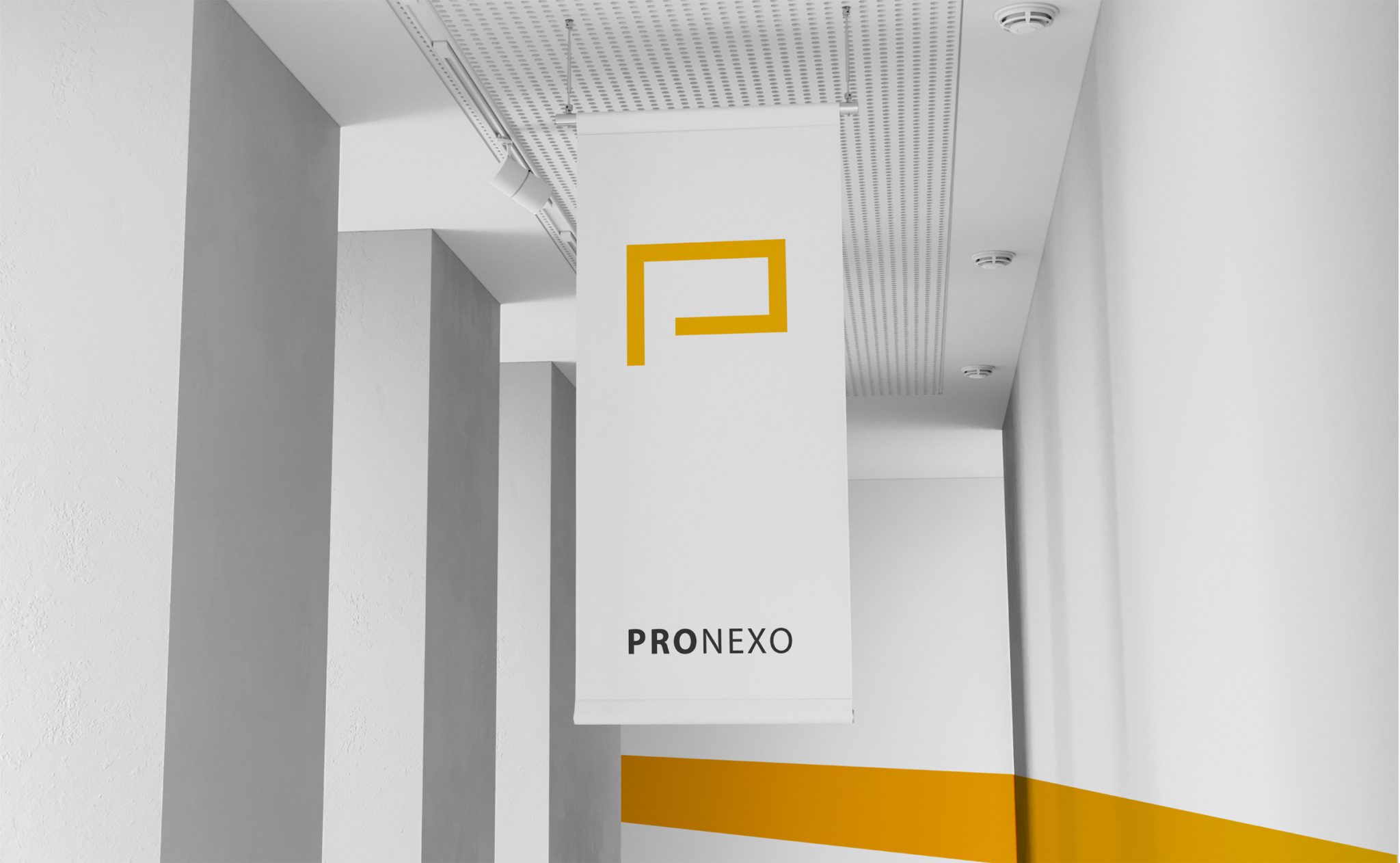
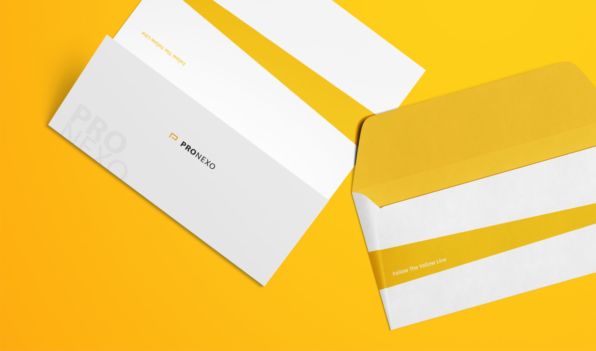
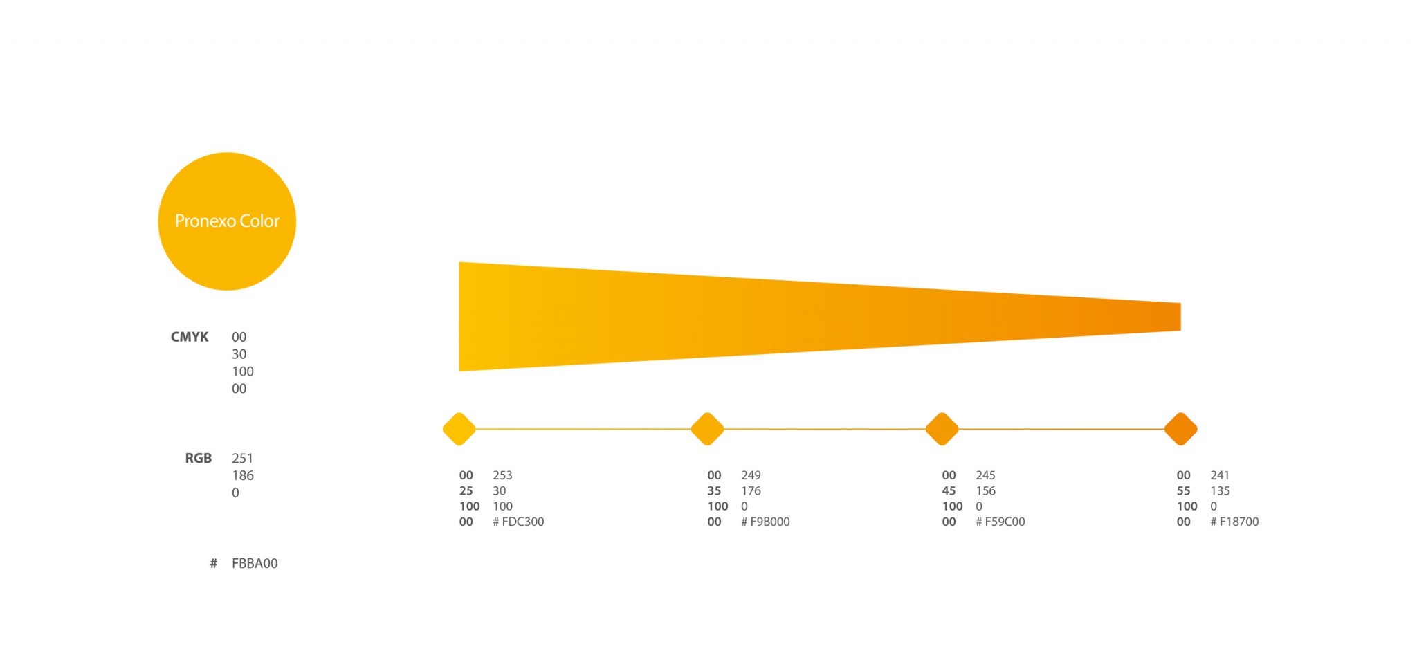
At the beginning of the project, the main challenge was to choose a way to design the image identity of the brand that would create the most differentiation from other competitors in the network equipment market. The choice of yellow color was the solution of Vand designers to solve the problem. In fact, this single color design strategy helped a lot in brand awareness and achieving the right position. Because before Pronesco, yellow was not used in the network equipment market, and on the other hand, it created a good distinction between this brand and other competitors.
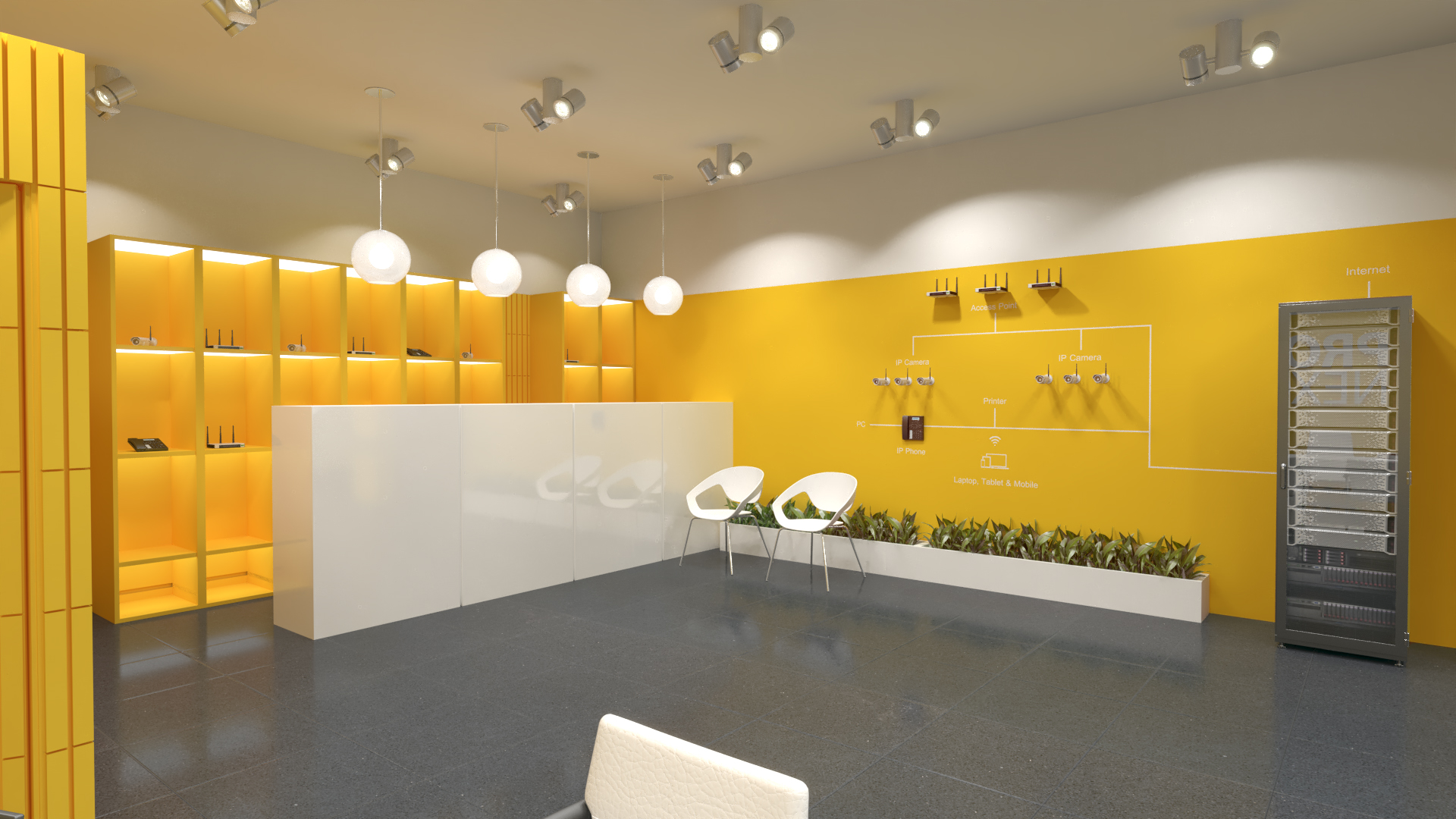
Yellow color is very important in Pronexo brand. As far as its capacities were used in other stages of the project, i.e. logo design and other brand contact points. For example, in the design of after-sales service department labels, catalogs, brochures and manuals, product icons and images, environmental advertising, documents and office papers, reports and presentations, invitations, graphics for events and conferences, table tags, photo instructions, catering and … yellow color was used.
Results and effects
With the development of the business, gradually the development of Pronexo brand also entered a more serious stage. In 2018, the Iran Passage advertising campaign was held. The aim of the campaign was to increase Pronexo brand awareness among the main audience of the brand by being present in the most important business center of the country’s network and equipment market. Here, too, the basis of the designs and the overall implementation of the campaign was based on the use of yellow color. Because in addition to guaranteeing the ownership of the yellow color for Pronexo, it also created an effective way of communication with the audience. In this campaign, the brand slogan “follow the yellow line” was used, and in the design of the environmental advertisements, the approach was to use the brand name and yellow color in the background frequently and maximally. In this campaign, the entrance sign of the passage, the t-shirts of the brand representative sellers, the floor guide boards, gift packages and advertisements, social network posts, etc. were designed by the Vand team.
The process of cooperation between Vend and Pronexo reached the design of internal and external visual identity of physical stores in 2019 and this process is still going on. However, what seems impressive in the branding project of this company is the development process of its transformation from a little-known company to a powerful actor in the field of network equipment. In fact, Pronexo is a successful example of a brand that believes in the synchronicity of brand growth and branding and has released its potential with this tool wherever needed: similar to following a straight line that ends in success.
Project partners:
Kiaresh Shammai – Marketing Manager
Daniyal Hosseinabadi- CEO
Team members:
Tourej Sabrivand-design strategist
Jalil Nourbakhsh – strategist
Project execution time: 2016