Rightel

A different mobile operator

Sliders-7

Description of the problem

Rightel Communication Services Company is the third national mobile phone operator in Iran that offers third and fourth generation SIM cards of the mobile phone network under the Rightel brand. Raitel is composed of two words “Rai” meaning “wisdom, intelligence, thought and thought” and Tel “short for telecommunication and means telephone communication”.

Rightel executives sought to create an identity that would be recognized as a different brand in the mobile operator market while showing the modern nature of the company and its services. So the main focus of Rightel’s branding was to create an identity distinction with the main competitors, i.e. Irancell and Haram Awl.

Challenges and solutions

In comparison with the first companion who had a government personality and Iransel’s teenage character, an exciting and energetic character was created for Raitel. In fact, in terms of personality and identity, Rightel should have been right in the middle of these two serious competitors. Because the audience group of the brand was made up of young business managers, who were different in terms of personality and character from the government managers of the first company or Irancell’s teenage customers.

The Rightel logo was designed based on the brand’s personality and with a minimalistic and completely abstract strategy. This logo is designed from the combination of three circles that indicate the third generation of mobile phones. Circles are also abstract forms of coverage areas of BTS antennas of third generation mobile phones that cover each other. Among the ways that the design strategists of the project thought would make Rightel distinction more prominent was the use of purple color. At that time, the use of purple was very bold. The color of this logo is one of the avant-garde colors that have been chosen in Iranian graphics for government brands.

Results and impacts

The philosophy of the logo is to show the personality of the brand. Rightel’s circular logo coped well with this task and is successful in terms of form and simplicity. In addition, the logo has created a more modern atmosphere for Rytel. However, the success of this logo is not only due to its form and design elements. Another sign of the success of the Rytel logo is its purple color. Shortly after the unveiling of the new identity of Rightel, many people from branding activists and business managers used the term “Rightel’s purple”. Due to the boldness and deconstruction of this color in the mobile operator industry, it is as if a new color has been created that did not exist before.

Updating and modifying logos is an accepted practice among professional designers around the world. After a few years, while Rytel and its brand and logo were completely fixed, the designers of the team noticed two very subtle flaws in the logo. One of the problems was the big circle in the middle of the logo. The second problem was that there was a thin line in the logo. Both defects were formal. The logo of Rightel was redesigned and correspondence was made with the managers of Rightel to use the redesigned logo. In the redesign of the new logo, while the problems of the previous logo have been fixed, the original identity of the logo has been preserved and the audience can still easily identify the logo. Rightel’s redesigned logo won the Silver Award at the “Grafis” World Competition (link to awards) in New York in 2018.


Rightel colleagues:

Dr. Mohsen Bastani (brand manager)

Dr. Shahin Arpanahi (Communication Assistant)

Arash Sultanali (Creative Director)

Logo designer:

Toraj Sabrivand – Designer

Project partners:

o2 international company

idea company (idea branding)

Project execution time: 2009

Rightel Communication Services Company is the third nationwide mobile phone operator in Iran that provides SIM cards of the third and fourth generation of the mobile network. Rightel executives sought to create an identity that would be recognized as a different brand in the mobile operator market while showing the modern nature of the company and its services. So the main focus of Rightel’s branding was to create an identity distinction with the main competitors, i.e. Irancell and Hamar first.

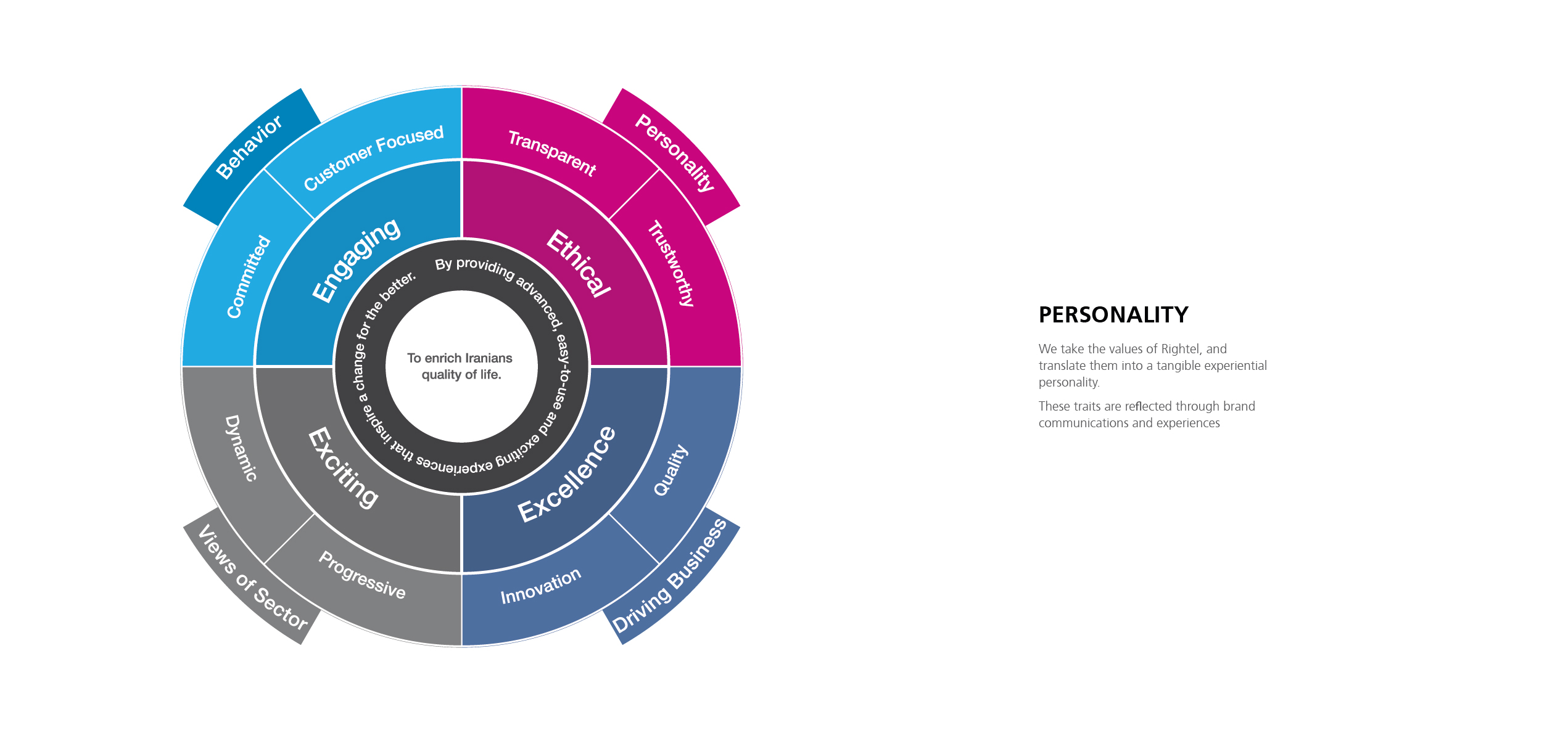
Compared to the first companion, who had a government character, and Iransel’s teenage character, an exciting and energetic character was created for Raitel. In fact, in terms of personality and identity, Rightel should have been right in the middle of these two serious competitors. Because the audience group of the brand was made up of young business managers, who were different in terms of personality and character from the government managers of the first company or Irancell’s teenage customers.

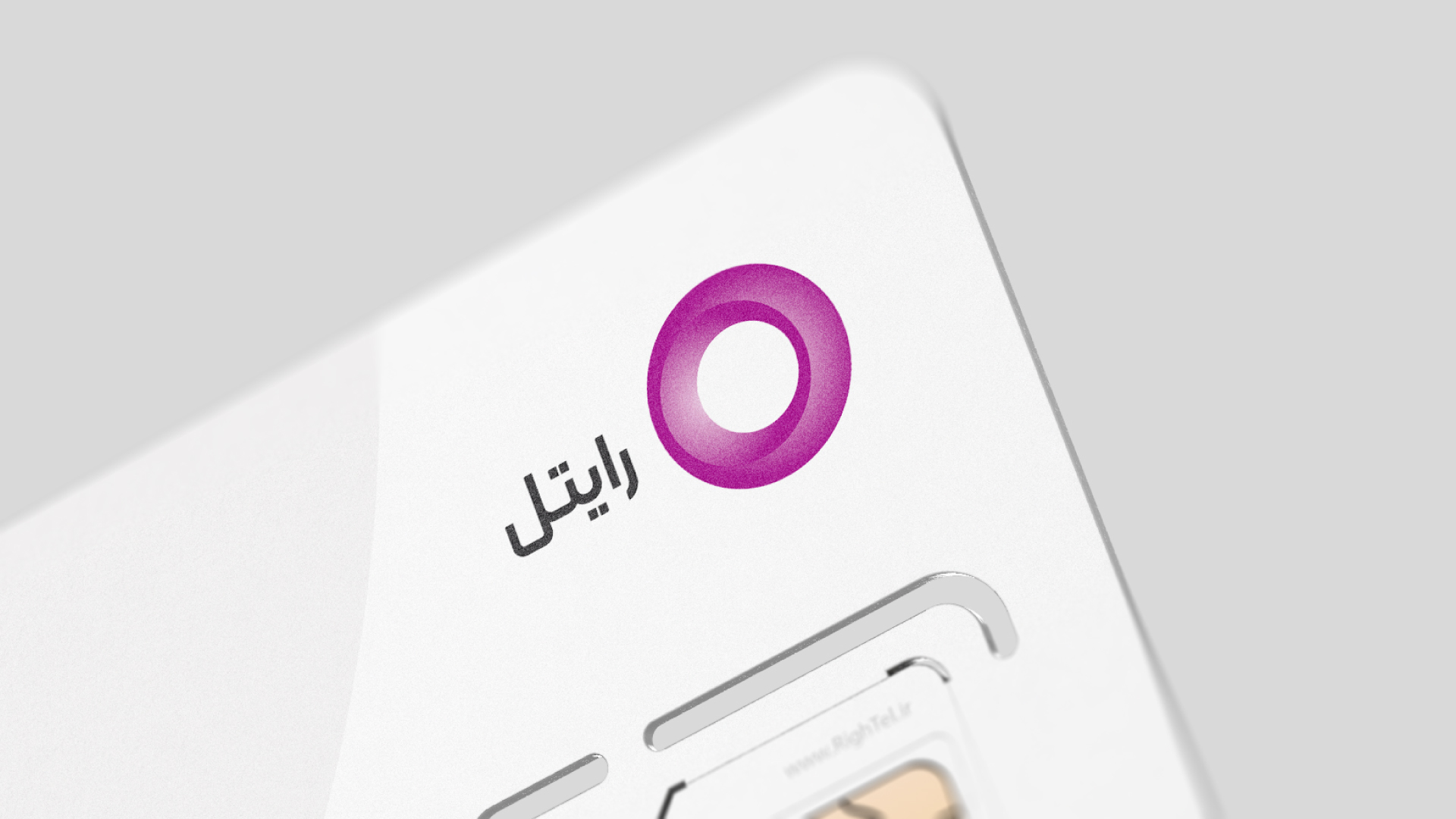
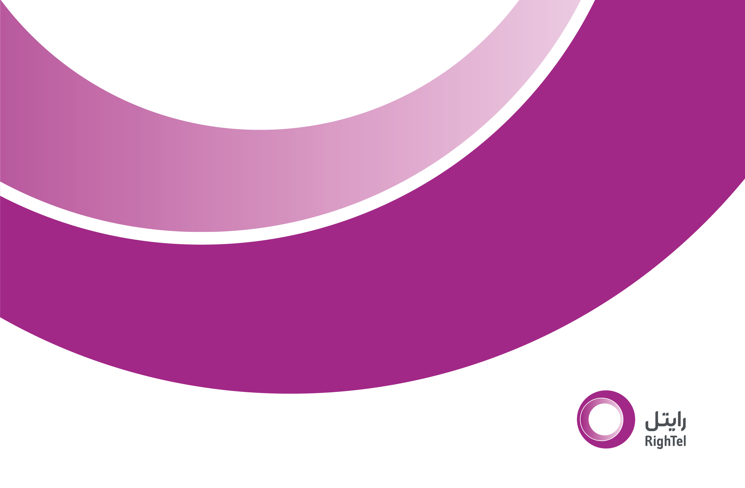
“Rightel’s logo is designed with a minimalistic and completely abstract strategy. The logo consists of a combination of three circles, which indicates the third generation of mobile phones. Among the ways that made the distinction of Rightel more prominent was the use of “purple” color. The color of this logo is one of the avant-garde colors that have been chosen in Iranian graphics for government brands.

“The philosophy of the logo is that it shows the personality of the brand. The circular Rightel logo coped well with this task and is successful in terms of form and simplicity. In addition, the logo has created a more modern atmosphere for Rytel. Another sign of the success of the Rightel logo is its purple color. Shortly after the unveiling of the new identity of Rightel, many people from branding activists and business managers used the term “Rightel’s purple”. Due to the boldness and deconstruction of this color in the industry of mobile operators, it is as if a new color has been created that did not exist before.

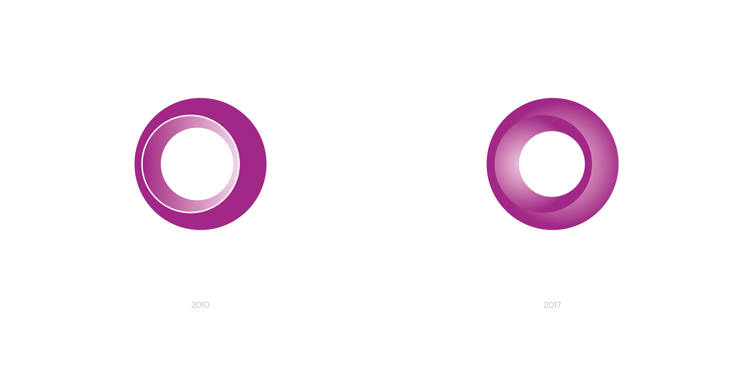
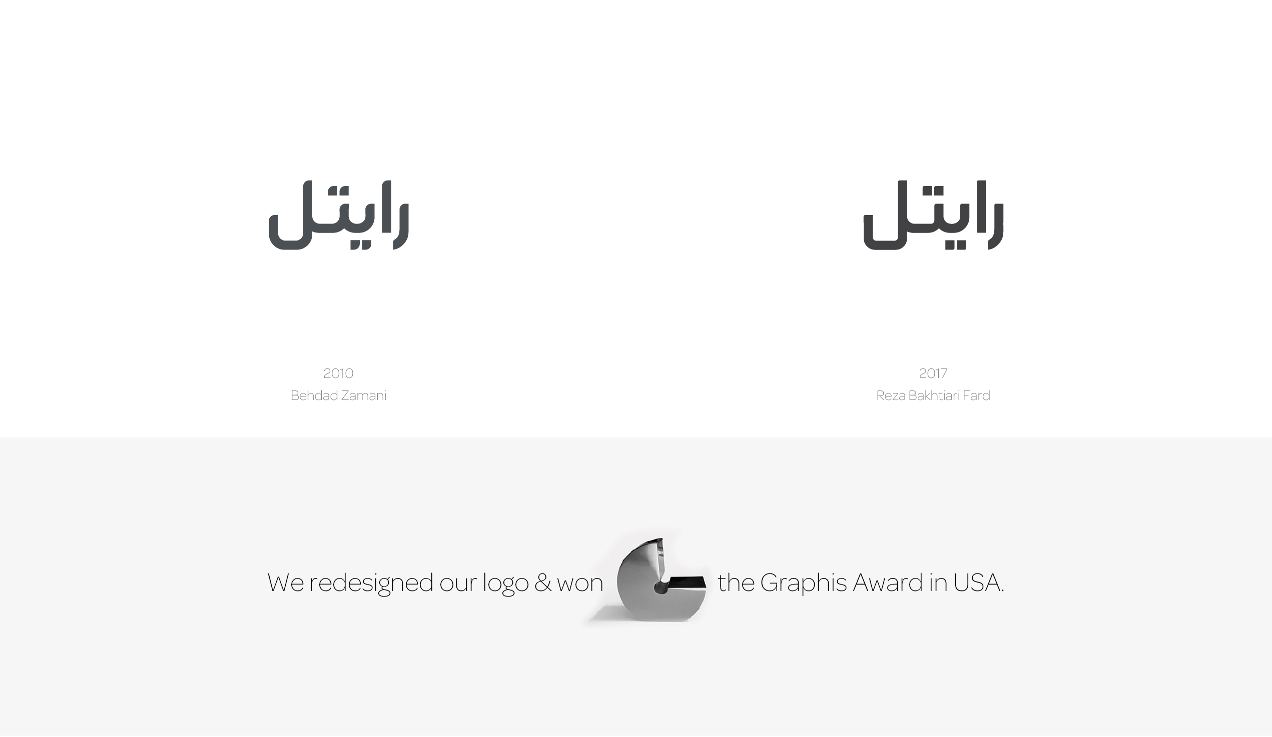
After a few years and while Rightel and its brand and logo were completely established, the designers of the team noticed two very subtle flaws in the logo’s form. The logo was redesigned and the management of Rightel was also contacted to use the new logo. In the redesign of the new logo, while the problems of the previous logo have been fixed, the original identity of the logo has been preserved and the audience can still identify the logo easily. In 2018, Rightel’s redesigned logo won a silver award at the “Graphis” World Competition in New York.