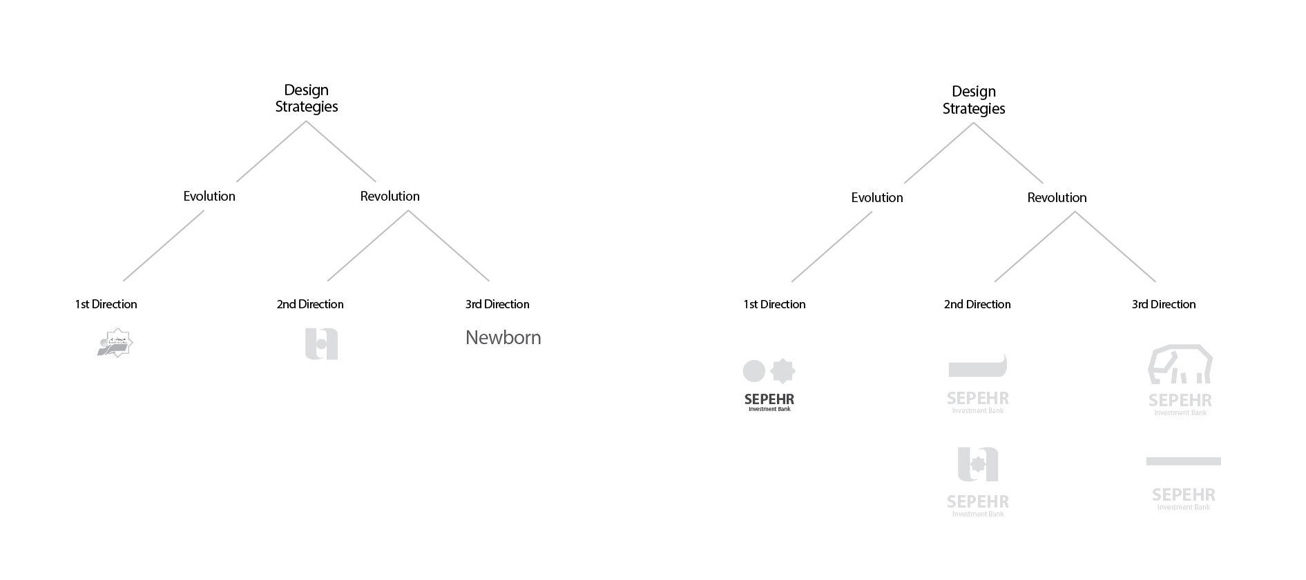
Solving the confusion of the previous logo and achieving visual coherence was our strategy in redesigning the visual identity of Sepehr’s capital. In the design of the Sepehr capital supply logo, we took the path of evolution and making it efficient by keeping the generalities of the previous logo.
We identified elements of Sepehr’s capital supply brand that it relied on for development and survival. These elements were the turquoise color palette and two visual elements of the sun and the circle, which were not visible despite being present in the previous visual identity of the organization. By removing the modifications, we made the Sepehr capital supply logo efficient and strengthened the mission statement of this organization’s growth.

Taking the path of improvement and evolution of the design and graphic assets of companies is usually an easy and restrained path. Using a part of the elements that have formed an inappropriate whole to create a new and appropriate symbol is a challenge that designers usually avoid. We in the Wend team, but taking into account the considerations that brands have, sometimes we see this path as the right path despite all its complexities, and through it and based on our standards, we achieve a professional result that is at the same time satisfactory to the brand.