Description of the problem
Sepehr Capital Funding, a well-known financial institution in the country’s investment industry and a subsidiary of Saderat Bank, had created a brand for the brand, but the development vision of its managers prompted the need to improve the image identity of the brand. Sepehr Funding came to Wend with two key needs: First, to fix the messiness of the current logo. Second, creating visual coherence across all touchpoints.
Challenges and solutions
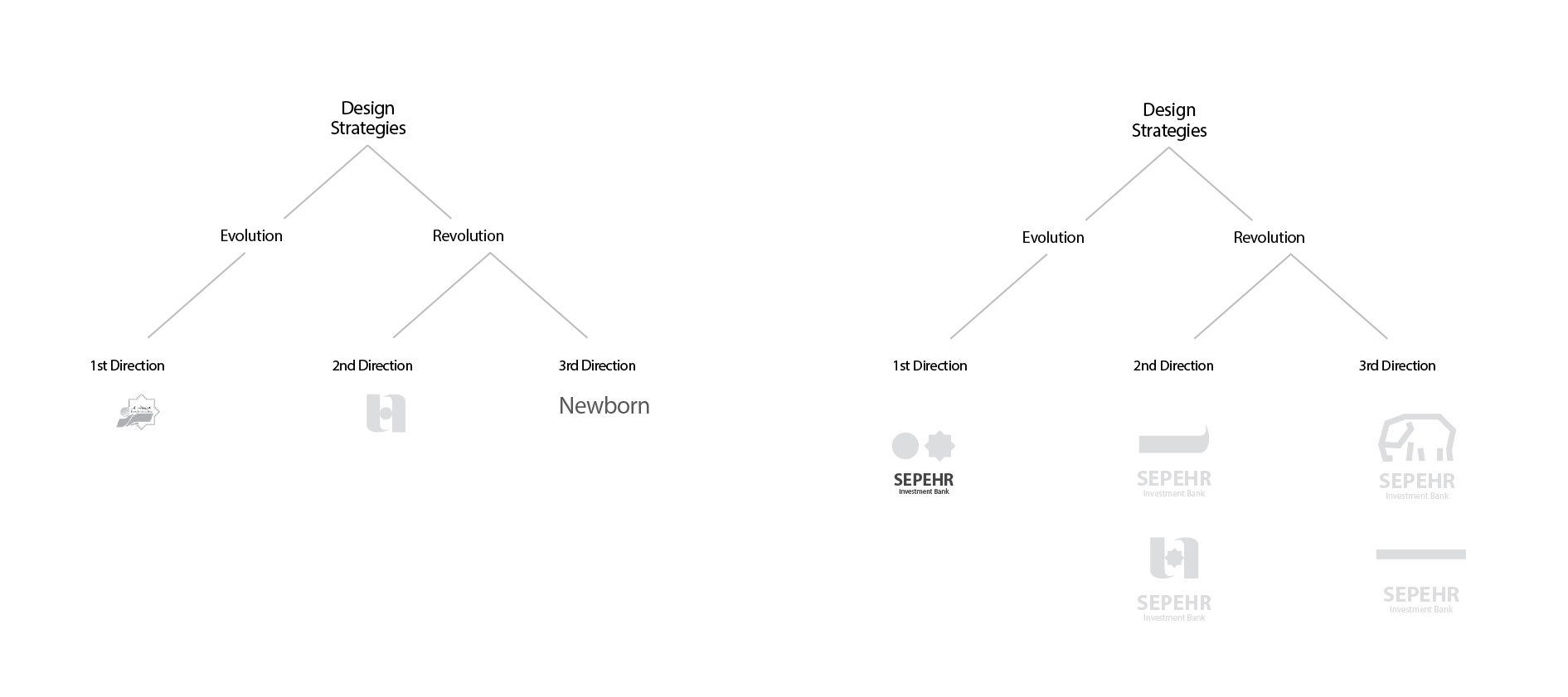
There is no predetermined solution in any project. In the first steps of every project, after clarifying the problem in front of us, we formulate strategies. The design strategy of the Sepehr capital supply logo was predicted from three completely different paths. Paths that some ended in fundamental changes (2 and 3) and others (1) followed an evolutionary path:
1. The path of development and improvement of the previous image identity
2. aligning with Saderat Bank’s image identity
3. Creating a completely new logo
In the consultation meetings, the Sepehr Funding Board wanted to preserve the generality of the previous logo, so by choosing the first path, we kept the sun, circle and turquoise color and removed the rest of the colors and forms.
Results
Taking the path of improvement and evolution of the design and graphic assets of companies is usually an easy and restrained path. Using a part of the elements that have formed an inappropriate whole to create a new and appropriate symbol is a challenge that designers usually avoid. We at Vand company, but taking into account the considerations that brands have, sometimes we see this path as the right path despite all its complexities, and through it and based on our standards, we achieve a professional result that satisfies the brand at the same time.
We identified elements of Sepehr’s capital supply brand that it relied on for development and survival. These elements were the turquoise color palette and two visual elements of the sun and the circle, which were not visible despite being present in the previous visual identity of the organization. By removing the modifications, we made the Sepehr capital supply logo efficient and strengthened the mission statement of this organization’s growth.
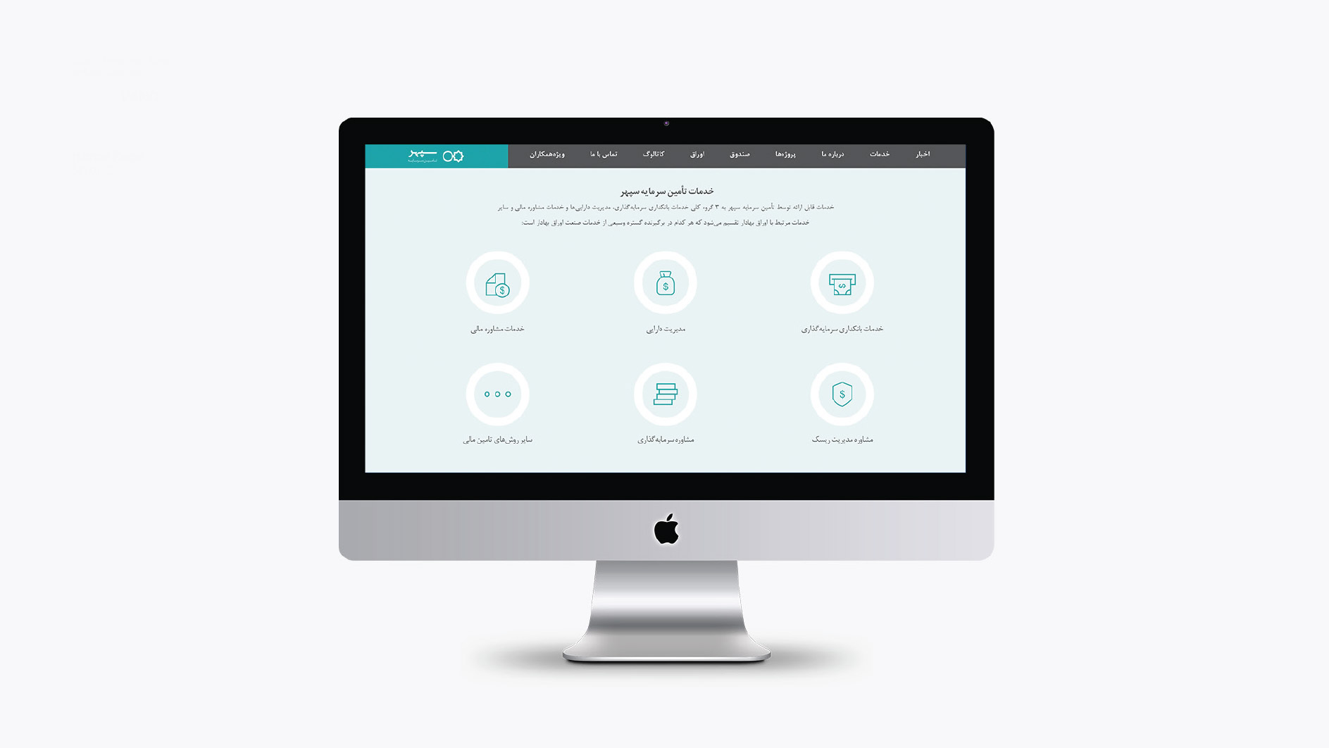
Then we developed the new image identity of the company based on the design capabilities of the two elements of circle and sun in all sub-brands. This visual identity has a thin and elegant line that has created a very high visual coherence in all the contact points of the company, including letters, letterheads, etc.
Sepehr capital financing partners:
Mohammad Watanpour – Vice Chairman of the Board of Directors
Abuzar Shirzad – Consultant
Team members:
Toraj Saberivand (Design Strategist)
Ali Jamali (graphic designer)
Nilofar Sharifi (graphic designer)
Project process: design strategy / brand image identity redesign / interior architecture design
Project execution time: 1396